Pop-Ups and UX – How To Make it Work for Your Website?

Many online businesses utilize some form of a pop-up on their website to help drive sales. These pop-ups can include sale offers, newsletter subscriptions or a number of other offerings. Some users find them very annoying, but this can be down to placement and presentation since marketers know they are an effective tool. A pop-up with a good context has conversions rates of over 40%, but working with them is a tricky business. This article will help you understand how you can make pop-ups UX work for your website.
A Good Pop-Up Gets Good Sales
Pop-ups and UX can help generate good sales when you respect your website visitors. Pop-ups on your website follow your users everywhere. Now, you don’t want your user tired or annoyed of your website. So, as a business, you need to create a pop-up that respects the space of the customer.
In many ways, a good pop-up is like a good salesman in a store who first lets the customer navigate and understand what they are looking for. After some time, they appear on the screen to talk to the client offering something that is relevant to what they are searching for.
Including pop-ups on your website is a great marketing strategy since it gives strong results and conversion rates. Not only can you gain the email address of your visitors, but you can secure data and insights. You know that this user is interested in a particular kind of content when they sign up on a pop-up.
How to Make Pop-Ups UX Work for Your Website?
1. Avoid Entry Pop-Ups – Display Based on Engagement
One of the pop up UX best practices is to avoid using entry pop-ups. Entry pop-ups normally interrupt the typical browsing and reading flow of a website user, it prevents visitors from gaining access to desired content, may offer irrelevant information, and generally makes visitors feel confused. The overuse of traditional entry pop-ups in the form of annoying advertisements is why Google has created webmaster guidelines to avoid the use of this outdated system.
Instead of irritating people on their first visit, wait for your visitors to get to know your website first and show your pop-up according to their interests. Display the pop-ups after a few seconds when someone is reading an actual page to catch the attention of inactive visitors. You can also show the pop-up after a visitor has scrolled down on your page in order to catch the attention of actively engaged visitors. The best time to place a pop-up is just before the visitor is about to leave the page.
2. Categorize your Visitors
Your pop up UX design will only be relevant for your visitors if it provides a solution to their problem. This can easily be achieved by dividing your visitors into categories, based on their interests. These categories vary by industry and product line. However, all businesses can group their visitors’ intro categories based on their interests, and even their stage of the buying process.
Here are some typical categorizing options:
- Location-based targeting – If you sell internationally, location-based targeting can be a great way to increase conversion rate. You can create as many different messages for as many target countries as you’d like for your visitors.
- Returning visitors – Returning visitors are usually more engaged in buying than new visitors who are learning about your website for the first time.
- Cold vs hot prospects – To convert hot prospects, you should encourage them to make an immediate purchase by engaging them in attractive offers like discounts or deals. To convert cold prospects, you ideally need to make them subscribe. After securing their contact details, you can reach out to them over time until they are ready to buy.
- Target visitors based on their stage in the buying process – In a typical buying process or “sales funnel“, your first goal is to get visitors into the funnel — this is known as awareness. You also need to guide them through the subsequent buying process – interest, consideration, intent and evaluation – before arriving at their final destination, purchase.
3. Customize your message
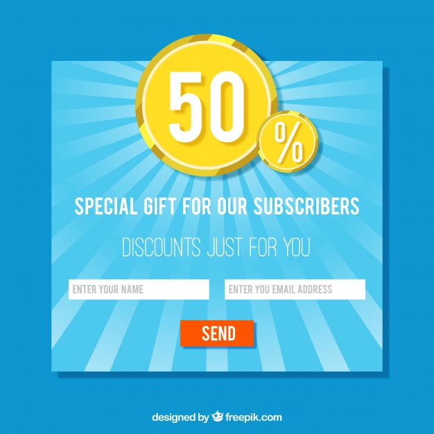
![Customize your pop up UX design based on your visitors’ interests]](png/pop-up-1.png)
Your visitors are diverse since they have different interests and they’re looking for different products to achieve different goals. Once you’ve categorized your visitors into groups based on their interests, demographic or geographic locations, you can show them the most appropriate message.

For example – If you sell footwear and a visitor is interested in Trainers, “25% OFF Trainers” is much more effective than “25% OFF Selected Products”.
This way, you can gather leads more effectively, because it allows you to display highly targeted messages to different visitor groups. To cut down the hard work, create one template and then alter the content according to your audience. Using this approach reduces the amount of wasted effort and ensures each of your visitors will see the most relevant content.
4. Stay focused on one goal and value proposition at a time
A value proposition is how you convince your customers to trust your products and services. To boost your conversion rate with onsite retargeting you should bound yourself to one goal or value proposition per pop-up and be sure to highlight it. You’ll decrease the chances of completing any of your goals if you are trying to achieve multiple goals with your pop-ups. This can delay decision-making and leave your visitors feeling confused. Ultimately, it will be hard to understand your message, and it will discourage visitors from signing up or making a purchase. It’s also important to clearly display your text in your pop-up and not use any distracting image or graphics that make it hard to read the content.
5. Less is More
When you ask your visitors to sign up for your newsletter, make sure to give them a special reward in exchange for subscribing, such as discounts, a free eBook, VIP membership registration, etc. Don’t ask for too much information as new visitors may be hesitant to give out their information and they may be too busy to provide detailed information about themselves. So, you need to compromise by keeping the “less is more” principle in your mind. The less information you request, the more conversions you will have.
In a Nutshell
By following these guidelines, you can use pop-ups UX on your site without ruining the user experience and usability. Remember to avoid entry pop-ups, make sure you define visitor categories and then display relevant offers. Stay focused on only one value proposition at a time, and don’t ask for too much information from your visitors.
Undoubtedly, you can increase the conversions on your site and improve sales with the help of attractive and relevant pop-ups UX on your website. Our specialized performance-based advertising and marketing services can help you achieve the best results for your business. Connect with us today.


I always was sceptical about using pop ups on our website – I know how much they annoy me when visiting a website. You kind of changed my mind on the matter – maybe i’ll try it in the future for conversion support.