Website Menu Design Essentials

Designing an e-commerce site or a business website, there are ready-made CMS templates to make it all really simple – nevertheless, even if we decide on using one, still one needs to mind website navigation. Only how to design the website navigation menu to secure both human and Google crawlers, robots or spiders usability?
The website navigation menu is simply the most central and crucial navigation tool there is. Its sole purpose is to help the users effectively find the content of their interest and enable them to get quickly and easily to the site location that they want. Therefore, the website navigation menu should be first and foremost simple and intuitive. Unfortunately – although UX rules become a framework for all digital design, not only website, and the menu is still considered a usability cornerstone of a website – surprisingly often it still fails the user’s expectations.
To get the most of it, while laying out a new website navigation menu, mind SEO while you’re at it! Rightly done, a website navigation menu can boost your SEO and make it easier to secure Google TOP10!
The information architecture – the absolute basics
At the very outset, what begs for a brief explanation, is information architecture. A variously explained concept, however, in the context of website design, defined as a of method of designing websites so that the content is structured in a user-friendly way – so that every visitor can quickly find what they need. The website information architecture includes:
- clear content organization,
- proper naming (labels),
- clear navigation,
- a user-friendly search engine
- and last, but not least – a well-designed website menu.
The IA is mighty. If information architecture works well, the site converts – simple. IA not only yields user behaviour response, but allows you to create it. That’s basically why usability-and-design-driven website building is the right thing to do, business-wise. The Apple’s Steve Jobs’s words “People don’t know what they want until you show it to them” fit here like nowhere else.
Google considers information architecture as a ranking factor, too. The HQ did confirm that the piece of sought-after TOP10 cake go the websites filled with unique, quality content, that’s well-organized and served exactly as users like it. This is yet another example of UX impact on SEO.
Now we see why the correct information architecture is so important – for an e-commerce or a business website, or anything. Now we can move on to the main focus of this entry, the heart of website navigation – the menu.
Website menu design checklist
When launching a website menu design process, make sure to follow these points:
- First and foremost: clarify the purpose of your website. What do you need – an Amazon-like huge e-commerce or maybe an online business card, with only few pages? Deciding upon a main purpose determines basically the whole rest of website navigation design process. Take a personal blog – the main menu will be relatively simple, linking to the About Me, Contact details page, and so on… Furthermore, if you want a side menu (displaying your latest or hottest entries), it may be, for example, a calendar or a list organizing your entries by months – but never forget organization tools such as tags or categories. However, designing a navigation for a large e-commerce is slightly more complicated. For a site of this type, a good navigation must include a breakdown of all the main categories, followed by subcategories, etc.; clarity is priority – how fast a customer finds what he or she needs, counts. For the reason of complexity, bad menu design most often happens to online shops / stores.
- Secondly: set the page menu structure. A properly designed tree view (allowing an easy and intuitive transition between categories as well as quick finding of individual items) is crucial for the whole website success.
- Thirdly: think about your naming / labeling / tagging. Simplicity wins the day – it is generally better to have a “Blog” tab, which clearly tells everyone that it links to a business blog, than to try come up with “creative” names, i.e. “inspirations”, “insights” or “know-how”.
- Fourthly: mind the user. Always. The whole design needs to be user-oriented, in order for your website to succeed – clarity and intuitiveness are the most important.
Basic website menu types – pros and cons
Before you decide on the type of menu, first consider where in the layout it will be. Left or right? Towards the top, or aligned with the bottom? Of course, users got habits, but there neither is nor ever will be an ideal design that every user digs, regardless of a billion other factors. That’s why the website purpose specification matters so much. Besides, if you really want to make sure your website and its navigation feature are user-friendly, consider doing a study as to its usability, on a good sample. A good website menu needs to both stay consistent with an overall website, and be user-oriented.
1. Horizontal tab bar menu – used mainly on smaller pages, usually is a tab at the top of the page, right above the content field.

Such a solution, although found quite often, has both advantages and disadvantages. The clarity is definitely an upside; so is the fact that such a menu is perfectly visible immediately after entering the site. In addition, it doesn’t take too much of the content-dedicated space. It looks kinda natural, too. As for the downsides: it requires perfect planning prior to the website launch due to a limited number of slots – it’s difficult to expand it with new buttons, especially when different displaying devices kick in. Usually, there are about 6-8 slots. On top of that, any link text in such a menu needs to be short – preferably one-word. Horizontal menus can be used either as the sole navigation tool, or in combination with, for example, side menu (i.e. for subcategories).
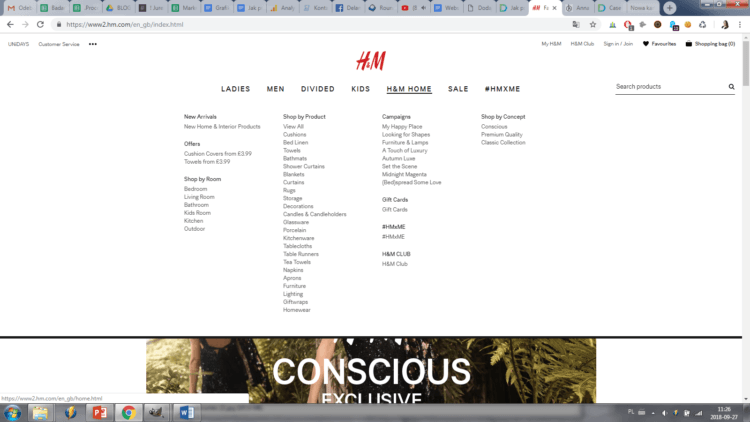
2. Pull-down menu, fly-out menu, pop-up menu, etc. – these are horizontal menus, but featuring various drop-down tab submenus. A solution very popular, particularly in e-commerce. The main categories are lined along the horizontal menu, and after hovering over them (sometimes only after clicking) a submenu with subcategories drops down.

This solution has all the advantages and disadvantages of a standard horizontal menu. An additional benefit, though, is the clarity they offer – all subcategories are clearly linked to their main categories, thus hinting the user about their whereabouts within the website. On top of that, it’s a really intuitive solution – if well designed, the logic behind the pages and pages will be obvious to anyone. As for the disadvantages – this menu may take up a lot of main page layout space, pushing all the content downwards, however, with drop-down submenus, it’s usually not an issue. Drop-down menu works well up to 2-level-structure of navigation; the more the “sub-” categories there are, the less clear the menu becomes.
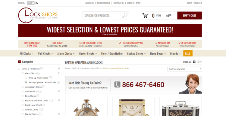
3. Side menu – a list, usually structuring one category below another. Sometimes, a subcategories list expands sidewise (not a perfect solution, BTW – necessitates a near-perfect cursor precision to click the right link, especially with multi-leveled menus), as in the case in the pic. Side menus are often found, especially in e-commerce with wide product range. It can either support the top menu, or be an entirely separate element. It is usually located on the left side (since people in most countries of the world read from left to right – so theoretically, the menu is the first to stumbleupon). Unless your focus is to get the user to read the content first, and only then look at the menu – then, align it with the right edge.
As you can see, user-centered design needs to be culturally sensitive; always get to know your target user – while most languages are sinistrodextral – read left-to-right, others are dextrosinistral – so, otherwise; even the eye-movement while scanning a website is culturally relative – for some users the looks come first, and only later they move on to category selection – the factors here are habits, consumerism, etc.).

A side menu allows structuring a wide range of products by category – long list links will look well in it. Also, it’s a good solution when a multi-leveled navigation is needed, still clearly showing the relations between categories and subcategories. Long names are also not a problem – names of the categories can have even up to a few words. In addition, such a menu is scalable – adding new categories is not an issue – therefore it’s a seems like a good choice if you’re yielding the possibility of the offer expansion.
The downside of the side menu is that it often takes up a lot of website space; besides it’s best to communicate clearly that the category levels can be further explored – to make the whole structure as clear as possible.
It’s certainly a very widespread solution. Often, it supplements the top menu. For example, the top bar lists the main categories, linking to pages, where also a side menu with subcategories is available – all for the sake of even smoother website navigation.

The e-commerce in the pic above uses both the top and the side menu, and also the so-called breadcrumbs – links to the pages previously visited. This makes the website navigation even more intuitive.
4. Hamburger menu – an icon for an unfolding, by default hidden menu. Used mostly in mobile apps, websites and portals; made famous in 2010 by Facebook, which has now shifted away this solution. “Hamburger”, because it looks like one 🙂
However, the icon itself goes back to the 80., being a design by Norm Cox (co-founder of Cox & Hall, a top design company) for the Xerox.
This type of menu works particularly well on all things mobile – apps or websites, however, is often used as a desktop solution, too. It fits the latest visual design trends. Minimalism rules the design all over the world after all. Some oppose hamburger menus, claiming an insufficient clarity of that solution – at least not for everyone.
Summary
Of course, website navigation menus come in all the more types – the list above merely scratches the surface. To design a menu perfect for your business, mind the golden User Experience rules. A poorly designed menu will make your conversion rate drop, after all – quality design and careful planning pay off.
As mentioned above, the best way to make sure if a given menu type works, is carrying out a professional user preference study, exploring the intuitiveness and clarity among the target group users. Never forget SEO, though – and good category naming – try to balance well the expectations of the human users, and search engine crawlers.


