17 Reasons Why Your E-commerce Site Isn’t Converting. How to Fix This?

You have an online store and you want it to grow. You decide to hire an SEO company, run Google Ads campaigns and thoroughly manage your social media. Consequently, your position in the search results and website traffic is increasing but despite all these actions, you still don’t have any tangible benefits. Does it ring a bell? Don’t worry, in this article we’ll explain to you why your ecommerce site isn’t converting. Keep reading!
Table of contents:
- What is Conversion?
- UX and Its Impact on E-commerce Conversion
- 17 Reasons Why Your E-Commerce Site Isn’t Converting
- The Purpose of the Website is Unclear and Its Design is Unappealing
- Poor Website Navigation
- Shopping Cart Not Working Properly
- Problems with Registration or Logging in
- Problems with Shipping Options and Online Payments
- Low Trust Levels
- Poorly Designed or Unclear CTAs
- Unclear or Incorrect Filters
- Challenges with Magnifying Glass
- Problems with the Product Page
- Error 404, Sold Out Products and Availability Notifications
- High Prices
- Your Website isn’t Mobile-Friendly
- Your Website isn’t Optimized
- No Remarketing or Retargeting Strategy
- Lack of Engaging Content
- Poor Customer Service
- The Takeaway
Contrary to what you may think, the situation described at the beginning of this article is pretty common. It often happens that despite having high website traffic, the e-commerce conversion rate isn’t satisfactory.
What is Conversion?
In a nutshell, conversion (CR – conversion rate) denotes recipients’ (or potential customers’) interaction with your store. This can be a purchase, subscribing to the newsletter, registering, and many more.
The definition of conversion isn’t clear-cut and may differ from one person to another because conversion is simply about the goals and other details that the store owners pay particular attention to.
Why is conversion important?
It enables calculating the number of conversions while taking into consideration all website visits. CR can be estimated using the following formula:
CONVERSION RATE = NUMBER OF CONVERSIONS/NUMBER OF USERS x 100%
How to analyze the results?
The head of online sales of the Esprit group, Jürgen Michelberger, states that 3% conversion rate for an online store is not only satisfactory but also a good result (Schrei vor Glück: Zalando oder shoppen gehen war gestern, Seidel H., 2013).
Obviously, this rate isn’t entirely calculable, as it doesn’t take into account situations when, for example, customers are looking for some information about a product online, but instead of ordering it, they decide to visit brick-and-mortar shops.
In spite of all, CR still remains a common metric used by online stores.
But what to do in situations when your CR doesn’t meet your expectations? There are many reasons why e-commerce conversion rate is low. Keep reading to discover the most popular ones and learn how to fix the problem!
UX and Its Impact on E-commerce Conversion
Why do we even discuss this point? An increasing number of people recognize the importance of the user experience.
Nowadays, before creating a new website or launching an app, companies conduct user research which involves monitoring potential users and how they evaluate the new digital product. This helps to avoid potential mishaps the company may not be aware of at the very beginning.
Not everyone thinks like you. Something obvious for you doesn’t have to be so obvious for others. If you want to improve your CR, your e-commerce should be user-friendly and transparent.
Why does it matter?
Users don’t like spending too much time thinking while shopping. Online shopping was supposed to be a pleasure, moreover, it should be fast and simple. Therefore, it’s essential to enable customers intuitive shopping without any unnecessary difficulties. When users can’t find something on one website, they enter another one.
SEO, social media, Google Ads, or other forms of internet marketing help online stores in the same exact way as regular advertisements help brick-and-mortar shops. They encourage customers to visit the store, but they can’t guarantee that people will make a purchase.
17 Reasons Why Your E-commerce Site isn’t Converting
Wondering why your e-commerce conversion rate is low? We’ve prepared a list of the most common reasons. Let’s delve into details!
1. The Purpose of the Website is Unclear and its Design is Unappealing
E-commerce is just like life, although many don’t want to admit it, first impressions count. So it’s more about fine feathers making fine birds than about clothes not making the man.
Your online store should catch customers’ attention and make them fall in love with it at first sight. If it’s not the case, this may be one of the reasons why your e-commerce site isn’t converting.
Why should you indicate the purpose of your website?
After spending a few seconds on your site users should be able to tell where they’re. They should know whether it’s an online store with sports equipment, dietary supplements, clothes, or anything else. The message must be clear and understandable no matter if the site is visited by a 20-year-old who regularly uses technology or by someone who has nothing to do with it.
Address a specific group of people and communicate with them to attract them, and increase sales. Make your page transparent, yet specific.
Why does it matter?
Let’s suppose that your store is first in the Google search results for the phrase “home decor shop”, but after clicking on the link users see sports equipment. They’ll probably be rather discouraged and either leave your store increasing the bounce rate or visit the competition which is second in the ranking.
Although it may seem absurd for you, online store owners frequently find it problematic to identify the purpose of the website and attract potential customers.
2. Poor Website Navigation
Why is the menu important? Menu is a starting point for people searching for specific products in your store. Obviously, they can use the “search” option at the very beginning but many of them will look at the menu first.
Menu should be in a visible and easily accessible place, preferably at the top of the site. Moreover, you should adjust the strategy of your store to users because, depending on the website, complex menus can either scare away or facilitate searching. Make sure that your navigation is intuitive, efficient, and transparent.
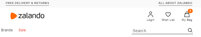
A good example is the menu of Zalando, one of the largest online stores with clothing, footwear, and accessories.
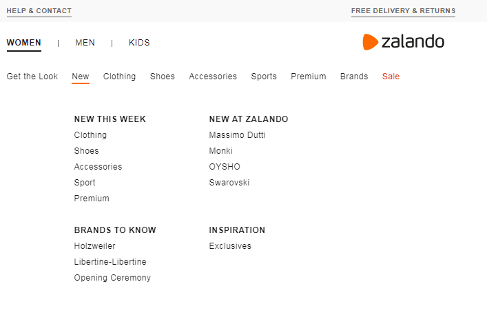
Theoretically, this menu is very complex but at the same time turns out to be minimalistic and easy to navigate.
Without any difficulties, you can spot division into “women-men-children” and other categories. You can also conveniently go back to the previous page from every menu item. A drop-down menu is fully operational but still doesn’t cover any important content on the page.
3. Shopping Cart not Working Properly
Why is your website not converting? Perhaps because of the problems with the shopping cart!
This element is essential for an online store. You should do your best to decrease the abandonment rate, meaning situations when customers add a few products to the shopping cart, but then resign, and leave the website.
A few useful solutions would be to:
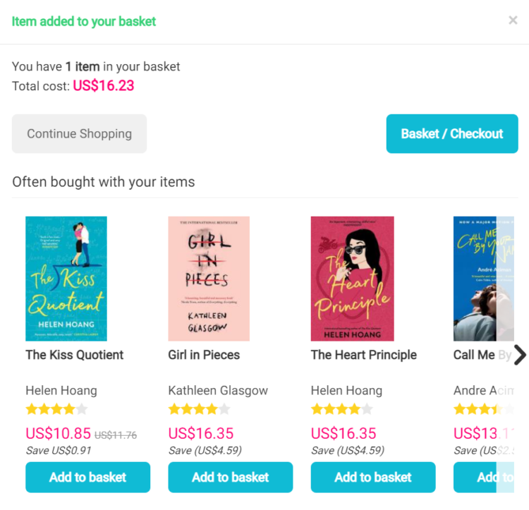
- Give users the option to continue shopping – most online stores don’t take customers directly to their shopping cart after adding a product to it, which is good, because this way people can freely continue shopping. However, even if customers in your store are directed to the cart after selecting a product, then it would be advisable to create a “continue shopping” button, that would allow going back to the last visited page, as returning to the beginning of the list after browsing over several product pages could be annoying.
A good example: the www.bookdepository.com bookstore – here, after adding a book to the shopping cart we’re given two options: “Continue Shopping” or “Basket/Checkout”.
- Give users the option to preview and edit the shopping cart on the home page, without entering it – it’s particularly useful when a customer selected some product accidentally. Moreover, it makes it easier to control the shopping. If you have a certain sum of money to spend and after adding a few products to your cart you realize that you’ve already exceeded the limit but you still want to buy something different, then the previewing and editing option can be a real life-saver.
A good example: Zalando, again. After hovering the mouse over the cart on the home page, its content unfolds. You can remove things from your cart, move them to the wish list, go to the checkout, preview the amount due, or double-check the size.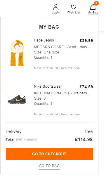
- Give users the option to change the variant of the product in the cart – let’s imagine that you decided to buy a dress but at the checkout, you realize that the chosen size won’t fit you. If you’re able to change the size in the cart, without going back to the home page and searching for the dress again, then it’s much more likely that you won’t abandon the cart.
- Use appropriate buttons with catchy content, color, and slogans – navigate the users in a transparent way to avoid situations when they feel unsure or misled.
- Remove all unnecessary items that aren’t related to the purchase process – they may distract or discourage customers from buying. Consider putting some tempting information about free delivery or fast shipment.
These should help you find the answer to why is your website not converting.
4. Problems with Registration or Logging in
Non-intuitive, inaccessible registration or login is also a reason why your e-commerce site isn’t converting.
It’s important to place the options to “create an account” or “sign-in” in a visible part of the website, the top right corner next to the shopping cart is frequently used for this.
A good example: Zalando
Subsequent registration steps also have to be clear and easy, that’s why you should remember about:
- Avoiding misunderstandings – if a user has to complete the “address” field, then it’s better to specify that you mean the “delivery address” at the beginning. Some shops have a separate option with “invoicing/billing address”.
- Indicating errors -if the field is completed incorrectly, it should be signaled in some way, so that users can modify it. There’s nothing more annoying than filling out the entire long form and then losing the data because of one error and yet it still happens on some pages.
An example concerning this issue: buying a train ticket via the Internet. After choosing a specific train (date and time), you choose a class, a seat, and a truck, for instance: second class, truck with compartments and a seat next to the window.
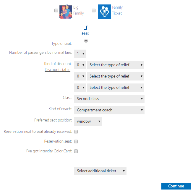
What happens next?
After clicking “continue”, you’re taken to a new window, where you enter the traveler’s name and confirm the choice. Then, options for creating an account, signing in, or buying a ticket as a guest appear.
Until recently, information about the lack of seats according to your preferences was displayed right here, just before making the payment and if you still wanted to buy the ticket, you had to repeat the whole process from scratch. Undoubtedly, it was driving most customers crazy!
Putting the information about a lack of seats just after choosing them was all that had to be done to solve the problem. Fortunately, the company finally noticed its mistake and now it simply offers another place instead of the occupied one.
- Keep it simple – based on the previous point you can conclude that it’s better to divide the registration into a few steps than to leave it long in one window. This way, it’ll seem more user-friendly. A long and tedious form often resembles a school exam.
There’s no need to force users to create accounts or log in, even though it’s beneficial for shop owners as it enables creating a customer database.
Why? Users very often don’t want to or don’t have time to create the account and therefore decide to abandon the cart. “Buy as a guest” is a desirable option worth considering.
5. Problems with Shipping Options and Online Payments
If you are asking yourself “why is my store not converting?”, we can surely say that shipping costs can kill the conversion.
Think how many times you gave up buying something only because of the expensive delivery. If you want to get a phone case that costs USD 15 but you have to pay an additional USD 10 for the delivery, you’ll probably resign.
Here, again, Zalando is a great example. It doesn’t charge for the delivery, even if you choose a courier option, it’s free. There’s no small print saying “free delivery from USD 100”. Moreover, returns are also very simple and free.
How is it profitable?
The store’s gaining recognition in many countries around the world despite the fact that according to Rubin Ritter, one of Zalando’s board members, and his interview for “Die Welt”, in January 2013, the return rate in their store came to 50%. It seems to be a part of huge costs which somehow fit into the nature of e-commerce. When it comes to brick-and-mortar shops, you pay for renting premises and in online stores, you have to pay for deliveries or returns.
What if you can’t afford free shipping?
Not every online store is as prosperous as Zalando but every store can price the shipping reasonably and adjust it to the industry. It’s also important to provide several shipping options, such as couriers, parcel lockers, or pick-up points. This way, the user is more likely to choose a satisfying option and your conversion rate will increase – a real win-win situation.
What about the payment?
Nowadays online transfers and PayPal rules. However, each of these options has pros and cons. Do your best to provide customers with a wide range of payment options, so they can make the best decision for themselves.
6. Low Trust Levels
Trust for products, brands, or even suppliers is crucial in sales, whether we consider online or offline stores. So one of the factors that decrease your conversion rate may be low customer trust in your e-business.
How to solve the problem? Well, try to:
- Avoid spam – reminding users about the abandoned shopping cart (for example, sending emails like “products in your shopping cart are still waiting for you”) or using remarketing are good ideas, but remember not to overdo it because you can easily deter customers.
- Use social proof – introduce such options as adding reviews (which can influence customers purchasing choices), real-time statistics (informing, for example, how many people are interested in a given product), cooperation with famous people, badges, or quality certifications.
- Make use of publicity – very often the media, even those local, mention online stores. Try to provide links to the sources and quotes concerning your store.
- Provide links to your social media profiles – apart from building the domain trust level they also increase customer trust. In the modern world, stores need to have at least a Facebook account to communicate with current and potential customers or to inform them about sales.
- Pay attention to advertising links or your partners – these factors can noticeably strengthen your authority and trust level, especially when we’re talking about recognizable and appreciated brands.
- Don’t forget about online security – your website should have an HTTPS protocol to ensure secure online transactions. This is a sign for your customers that they can make payments safely. Nowadays websites without secure protocol are seen as dangerous. Potential customers can be stopped from entering your online shop by their systems which will recommend abandoning an unsafe website.
7. Poorly Designed or Unclear CTAs
Do CTAs matter? Call to Action is simply a tool used to instruct users and tell them what to do on your website.

Often it’s a link in the form of a button, graphics, text, or a slogan that encourages users to click on it. It should lead to subscribing to the mailing list, creating an account, writing opinions, or adding products to the cart. Seems simple, however, designing a proper CTA gives many UX designers or web developers sleepless nights. Believe us, this small button can make a significant difference.
To increase your CTA effectiveness you can:
- Make sure it’s visible at first glance (color, font, and shape);
- Make it immediately obvious that it’s “clickable”;
- Use first-person singular as often as possible – the research carried out on Unbounce users indicated that swapping the word “your” into “mine” was enough to increase their conversion even by 90%;
- Be precise – try to communicate clearly the intended use of every button. “Download free PDF version” will work better than the button with the book title or the mysterious “click here” link. Don’t forget about mobile versions, the button should look equally efficient on all devices.
Call to action doesn’t have to be very serious, it can be funny or even cute, depending on your target group. If you’re creative, it’s worth giving it a try.
8. Unclear or Incorrect Filters
Filters may be one of the well-known reasons why your site isn’t converting.
If users can’t easily sort products on your website by size or producer, they may find it hard to find something suitable for themselves. Online shopping is mostly about saving time – that’s why not everyone wants to spend hours browsing the entire collection, in fact, most people prefer to find particular products straightaway.
Why are filters important?
Filters affect the user experience. When customers visit an online store, they already (more or less) know what they’re looking for. If you make it easier for them to find necessary products, the likelihood that they’ll buy them increases.
Some tips regarding filters:
- carefully consider their operation;
- think about their placement order, it’s important;
- give users multiple choice, for example, choosing both size and price;
- take care of easy filter removal, it’s also important;
- try out different solutions.
9. Challenges with the Magnifying Glass
Nowadays clear and easy searching for products is a key in online shopping. Customers don’t browse the online store to find any shoes, they’re looking for a specific model, brand, color, or size.
So if you’re still wondering why your e-commerce site isn’t converting but the magnifying glass doesn’t work properly, you probably have the answer to your problem.

Tips for the search box:
- Put the search box in a visible place – the top of the page is commonly used for that purpose and customers got used to it due to search engines such as Google;
- Mark the search box with the magnifying glass icon – it’s already so popular that giving up on it can cause users many troubles and as it’s universally acknowledged, you shouldn’t make your customers feel confused if you aim to increase the conversion rate;
- Focus on the accuracy of the results – if customers ask for red pots and instead find green plates, they’ll probably go to other stores.
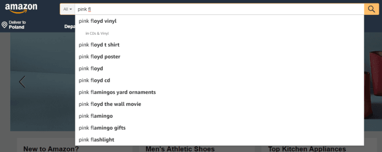
Suggestions? Why not! It’s a good idea to suggest to users the search terms, sometimes there are typos or people may know only the title of the book or even its fragment, but not the author. Then, such hints are very useful.
10. Problems with the Product Page
Obviously, first impressions count and everything discussed above is equally important. But all of these are pointless when the product page doesn’t meet the expectations. It must contain all the necessary data about a given product, moreover, it shouldn’t only present it but also encourage the user to purchase. So, what can help?
- Good quality and aesthetic pictures – very often unattractive photos of clothes on a dummy not showing any details or how the clothing lies on the body deters customers from buying and browsing the store;
- Zoom on products – people like to examine the products they’re about to buy. Details are important;
- Visible and clear prices;
- Proper presentation of all product color or pattern variants;
- Accurate and unique descriptions that will resolve any doubts concerning products;
- Opinions about the products, especially useful in terms of clothing stores. Customers often share valuable information concerning the size or color which can reduce the return rate.
11. Error 404, Sold out Products, and Availability Notifications
The assortment of online stores, especially these large ones, changes frequently. New products are constantly added, while the old ones are removed, which may lead to confusion.
What happens in such a situation? When customers try to enter a specific page, they’ll probably see the 404 error. Then, in most cases, users will quickly leave your store, unless…
- you’ll offer some alternatives – presenting products similar to these unavailable ones can be a great idea. A message saying that you’re sorry but a given product isn’t accessible at the moment and a link with photos to its alternative should be enough;
- you provide an availability notification form if you know that the product is unavailable only temporarily -if customers really care, they’ll certainly complete it and appreciate your effort;
- you use links redirecting customers to other sites with similar products and thanks to that you won’t lose the traffic. However, this solution has its drawbacks – users may feel distracted and lost.
What if the above solutions aren’t applicable?
The 404 error page can vary. It may be only a simple and official message or a funny picture combined with a catchy text. Use it to your advantage to boost UX and make a positive impression!
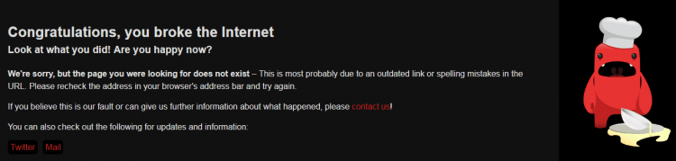
An example of the 404 error page from the soup.io website:
And here, is another example from the CSS Tricks website where the message refers to the website theme (as the name suggests it concerns the tricks used in CSS):
12. High Prices
Let’s be honest – even perfect SEO, UX, or website design won’t help if your prices aren’t competitive.
Why?
You can offer the most beautiful photos and unique product descriptions but if your prices are much higher than the prices of your market rivals, you’ll never get a satisfactory conversion rate. On the Lemonstand blog, you can read that for 60% of people the price is the most important factor affecting decision making.
Think through your sales strategy, because it might be a reason why your e-commerce site isn’t converting.
13. Your Website isn’t Mobile-Friendly
Is it really important? Yes!
Actually, it may be one of the main reasons why your site isn’t converting. We live in a time when an increasing number of users browse the net on mobile devices when going back from work, or commuting to school.
Read more about making your website mobile-friendly: https://delante.co/mobile-seo/
If you want to reach them, your website should have a responsive design displayed properly on devices like smartphones and laptops. Only then, you can compete with market tycoons.

14. Your Website isn’t Optimized
SEO helps websites reach people potentially interested in specific products, or services. Optimizing your content for relevant keywords and marking important pieces of information with <b> or <em> tags is a great way to increase positions in the search results.
Why should you do it?
As you know, the higher the positions, the greater the chance that people will visit your website. If they visit your website and all the remaining elements work properly, there is a huge probability that they’ll finalize transactions.
What can you do?
- Use specialist tools like Google Search Console, Ahrefs, or SEMrush to do keyword research and check when your website is displayed in the search results,
- Optimize your content for the most important phrases (remember to use them naturally),
- Take care of internal linking,
- Make sure that your content is unique and isn’t duplicated.
If you’re not an SEO expert check out these SEO Quick Wins – 8 Simple Activities Google Loves
15. No Remarketing or Retargeting Strategy
Creating a remarketing strategy will allow you to reach potential customers who have been interested in your products, but for some reason have changed their minds.
Maybe they have left your website on purpose, but maybe it was an accident and they can’t remember the name of your store and don’t feel like checking 100 other e-commerce sites they visited that day?
Remarketing can help you reach people who have already come into contact with your e-commerce and it may convince them to buy your goods!
16. Lack of Engaging Content
Does it really matter when talking about e-commerce conversions?
Of course, it does! Engaging content may be an element that can help you gain a competitive edge over your market rivals. It’s a great tool that gives you a chance to position yourself as an expert and build relationships with potential buyers.
Instead of copying product parameters from manufacturers’ websites, create catchy descriptions that will intrigue potential buyers. Make use of elements such as:
- CTAs,
- Question tags,
- Rhetorical questions,
- Infographics,
- Language of benefits.
17. Poor Customer Service
So, you’ve read all the reasons above, but you’re still asking yourself “why is my website not converting”? Have you taken your customer service into account? It’s more important than it seems!
In times when almost every industry is extremely competitive, staying on the cutting-edge requires outdoing your market rivals in every possible aspect, including prices, payment methods, delivery options, product descriptions, and images, or customer service.
Make sure that people visiting your website can easily contact you if they have a hard time finding the necessary information.
What can you do?
- Think about implementing a live chat where users could ask questions on an ongoing basis,
- Create a FAQ section with the most popular questions,
- Provide your contact details: phone number, address, and email,
- Reply to users’ comments and reviews (especially the negative ones),
- Keep in mind that the customer is (or should be) always right.
The Takeaway
There are many reasons why e-commerce conversion rate is low. Maybe you’ve forgotten about mobile users or an appropriate remarketing strategy. Maybe your products don’t reach the target group, your website content isn’t engaging enough or something else doesn’t work properly.
If you checked everything we mentioned in this article and you’re still wondering, why is your store not converting, contact us, we will be more than happy to help you increase your sales!
This is an update of a text published in 2019.


