Mobile SEO. A Complete Guide for Mobile Devices SEO

What Is Mobile SEO? Mobile SEO is a process of website optimization which is aimed at its proper functioning on mobile devices. With the right optimization, a considerably greater user experience can be achieved, as the website is adapted to various types of devices, and rank higher in the search results. Running a long-term mobile … Continued
What Is Mobile SEO?
Mobile SEO is a process of website optimization which is aimed at its proper functioning on mobile devices. With the right optimization, a considerably greater user experience can be achieved, as the website is adapted to various types of devices, and rank higher in the search results. Running a long-term mobile SEO process has a positive impact on the increase of mobile traffic, conversion rate and lead generation.
Proper mobile optimization should also focus on problems that desktop-designed websites don’t experience (or at least not on such a scale). These include, for example:
- small screen sizes – for this reason, it is much harder to include all the elements on a website,
- wide range of devices – it’s hard to implement one solution that will work properly on all types of mobiles,
- mobile browser compatibility – not all types of code will display correctly on each browser.
Why Optimize For Mobile? Statistics
Is it even worth investing time and money on mobile SEO? Will a properly optimized website for desktops not ensure business success? Well, the lack of website optimization for mobile devices keeps you away from achieving success with your business. And here’s some proof:
- 50,88% (July 2020) of web traffic comes from mobile devices, 46.39% – from desktops (source: gs.statcounter.com). The upward trend for mobiles has continued for several years now. To compare, in January 2015, 31.06% of all website traffic came from mobile devices and 62.38% from desktops.

- Already in 2016, 90% of Amazon’s customers declared that at least once they made a purchase on a smartphone (source: State of Amazon 2016).
- More than 40% of all online transactions occur on mobile devices (source: thinkwithgoogle.com).
- 74% of users are willing to come back to a site that is optimized for mobile devices.
- 52% of users are less willing to engage with a brand once they had a negative mobile experience (source: webfx.com).
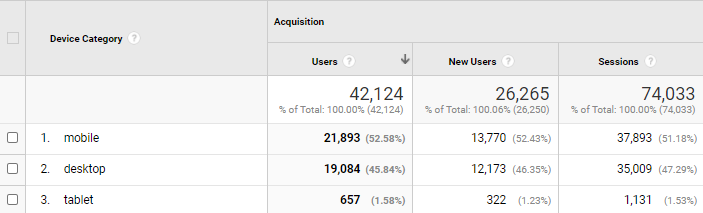
How To Check Mobile Traffic?
The easiest way to check whether your website generates high mobile traffic is simply to sign in to your Google Analytics account. There you will find all the information needed. Just navigate to Audience and then to Mobile. You will see the number of visits to your site from different types of devices in a given period.
Test for Mobile-Friendliness
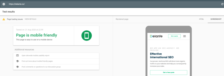
Before you start your adventure with mobile SEO at all it’s best to check whether your website is currently in good shape. Luckily, there are lots of tools that can help you with that.
It is a good idea to start with a completely free tool introduced by Google: Mobile-Friendly Test. All you need to do is enter the URL of your website and the tool will generate a report from which you will discover which elements require optimization for mobile.
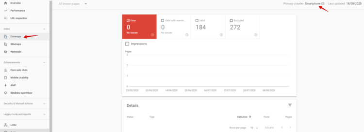
If, in turn, you want to find out whether your website experiences any mobile crawl issues, Google Search Console is the best solution. In the previous version there was a window with Crawl errors, now you can find information about crawling in the Coverage section. Remember to indicate the primary crawler, i.e. which user agent type generates the data.
Mobile SEO Optimization Guide. 10 Key Elements
1. Website Speed
With no doubt, this is one of the most important aspects of website optimization for mobile devices. When starting to cooperate with new clients, we often notice that the page loading speed is much slower on mobiles than on desktops. It turns out that even if you improve the page loading speed on desktops, it will not automatically improve it on mobile devices.
And after all, you have to keep in mind that this is one of the main ranking factors for search engines and, moreover, slow page loading increases the bounce rate also. So don’t ever neglect it!
How to verify which elements need to be optimized to improve page loading speed on mobile devices? PageSpeed Insights will give you lots of valuable hints! This is a free-of-charge tool created by Google to measure the performance of any website on both desktops and mobile devices. Just enter the URL of your website and this tool will provide you with information about elements that need to be improved.
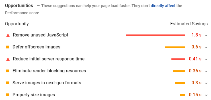
These elements have the strongest impact on slow website speed on mobile devices:
- uncompressed and unoptimized images,
- non-minified HTML, CSS and JavaScript code,
- long server response,
- too many redirects,
- ignoring CDN (Content Delivery Network).
2. Responsive Design
Simply put, responsive design is the adaptation of the page layout to various devices (desktops, tablets, mobile devices) on screens of different sizes. It is particularly important that all functions of the website should remain the same on each type of device and be accessible to users.
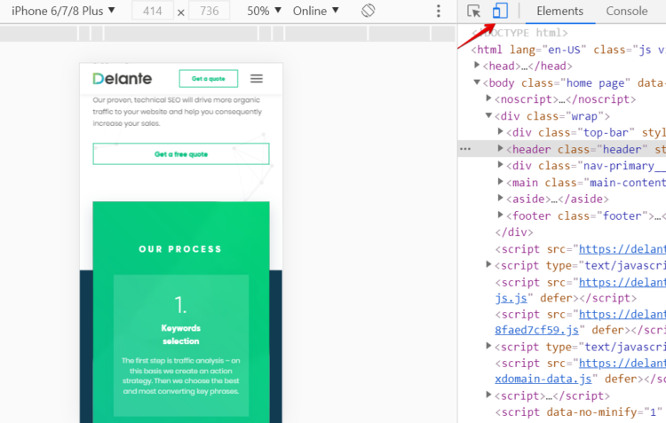
Would you like to easily check how your website will look like on mobile devices? You can do this in a web browser, such as Google Chrome. Right-click and select Inspect, then you will see an option to adapt the page layout to different sizes. I chose iPhone 6/7/8/ Plus and as you can see below, the design of our website is responsive and adapted to mobiles.
I also recommend a great and free-of-charge SEO tool, WooRank, which shows Mobile rendering – this way you can see the preview of your website on both mobiles and tablets.

3. Dynamic Serving
Many people have not yet heard of dynamic serving, however, this element appears to be particularly important when dealing with website optimization for different types of devices.
Owing to this solution, the server responds with different HTML and CSS code from the same URL depending on the device (desktop, mobile or tablet). This is possible mainly with Vary HTTP Header, which informs a web browser to differentiate the displayed content of a page depending on the user agent. If you would like to learn more on how to correctly detect user-agents, Google has prepared an exhaustive guide for developers.
4. Separate URLs
Since Google is unable to automatically identify that your website on mobile devices and on desktops has two different versions, you need to implement separate URLs to help with correct interpretation. Separate URLs usually appear as follows: www.address.com for desktop users and m.address.com for mobile users.

How to inform Google and instruct crawlers that they deal with two separate sites? Well, it takes a bit of work to achieve it:
- On the desktop version of your page, you need to insert a rel=”alternate” attribute which will direct to the corresponding mobile page.
- However, on the mobile version of your page, you need to insert a rel=”canonical” attribute which will direct to the corresponding desktop page.
Keep in mind that preparing separate URLs is a bit complicated and if done improperly, it can introduce errors, which is why I recommend you to ask your developer to implement this solution.
5. Local SEO
With so-called near me searches (keywords containing phrases such as “near me”, “closest”, “open”, “nearby”) local users may much faster discover your business and make a purchase. You don’t believe it? According to a survey conducted by Google, as many as 76% of mobile users looking for something nearby visit a related business within one day. Moreover, 28% of such searches lead to conversion, i.e. making a purchase (source: thinkwithgoogle.com). So as you can see, focusing on local SEO leads to a huge increase of your business growth. This applies to desktop users, of course, but it is even more significant when it comes to mobile users.
How to optimize for local?
- Create a Google My Business account – add all necessary information: company address, contact information, opening hours,
- Reviews – the more positive the reviews, the better; users really pay attention to them, especially the ones added recently,
- Images – add photos to your Google My Business account,
- Create locally oriented content – mention in the content on your website which city or neighborhood you operate in, it has an impact on positions in local search results,
- phone number and e-mail address – add clickable contact details on your site so that users can get in touch with you more easily.
6. Title and Meta Description Optimization
Mobile screens are much smaller in size, that is why it is so important to show users as much information as possible about your website in the search results. As you can see below, a snippet on desktops contains more characters than on mobiles. Simply put, when optimizing your website for mobile devices, you lose several characters…

To get the best results, be sure to add the most relevant keywords at the beginning of your title tag and meta description. This will make sure that mobile users actually see the keyword. Keep in mind that including short CTA (Call To Action) in your meta description is a perfect solution to increase click-through rate.
I also recommend the incorporation of emojis, even though they do not have any real impact on ranking in the search results, but they do attract users’ attention and intrigue them.
Take a look at the example:

7. Schema Structured Data
Currently, structural data is definitely one of the most important elements of SEO. Google simply loves organized websites and rewards them! So what exactly can you gain thanks to the properly prepared Schema.org? First of all, it is a sort of interaction between your site and Google robots – you instruct the crawlers what is the meaning of each element on your site. And as a reward, a search engine will additionally show these data in the so-called rich snippet.

Structured data may also boost your CTR. How is that? As you can see in the above screen from the search results, pages with the structured data occupy more space becoming more visible and eye-catching to users. What’s more, just look at the recipes from the culinary blog Tasty – they additionally have ratings or the number of votes which may encourage users to choose this website. Implement structured data and see for yourself how it will affect your mobile SEO!
8. User Experience
A growing number of users search for websites on mobile devices instead of on desktops. It is simply much more convenient for them. Note that even if users access your website via desktops, they have probably already interacted with it via a mobile device before – If it takes forever to fully load your website on mobile or its content is illegible, a user simply will never return to it and will choose your competitors instead. So never neglect mobile user experience and try to make a very good first impression!
What exactly drives users crazy about websites on mobile devices?
- Slow page loading speed (go to step 1 if you would like to learn more about it),
- illegible content – make sure you have the right font size and contrasting background to maximize visibility,
- tiny buttons – make sure all the mobile buttons are big enough for fingers (be fat-finger friendly),
- unclickable contact numbers – users don’t want to rewrite your phone number or copy it, provide them with clickable phone number,
- chaotic design – ensure a transparent content structure and visual hierarchy,
- using web controls – selecting mobile controls allows for greater user interaction.
9. Pop-Ups
Google wants websites on mobile devices to be accessible to all users, so it has introduced an algorithm that penalizes websites with numerous large pop-ups that cover up content and make it more difficult for users to access a given page. So don’t bother users with excessive pop-ups or interstitials intended for subscribing to the newsletter or signing up.
I’m not saying that pop-ups are a bad thing – if you introduce them in a way that doesn’t annoy users and complies with Google’s rules, you’ll get a positive reception. Remember that users really hate pop-ups that are quite clumsy to close, which is even more difficult on mobile devices for them, that’s why you should always provide a large enough closing button.
10. Voice Search
Have you ever considered the importance of voice search in your SEO strategies? I’ve noticed that many SEO experts still tend to ignore it, but it turns out that mobile users are really starting to trust the voice search. This topic has been present for some time now, but recently thanks to the rapid development of Home assistant provided by Google or Siri from Apple things have really started to change much faster.
How to prepare for voice search?
- Focus on conversational long-tail keywords – mobile users use more natural language so, if you want to increase mobile traffic, bet on keywords in the form of long sentences or questions, e.g. “How to prepare a perfect cheesecake”.
- Prepare content that fits users’ needs and provides answers – choose a long format content that has a better chance of appearing in so-called featured snippets. If you’re looking for ideas for the right questions to answer with your content, just take a look at auto-filling in Google – there you will find plenty of hints.
Conclusions
If all this time you have been ignoring mobile SEO, and instead you have focused only on optimizing for desktops, you have actually missed a great opportunity to increase valuable web traffic. So it’s about time to change that! Mobile traffic has a great future – the worldwide web traffic on mobile devices is growing year on year and this trend is likely to continue.
If you need expert help in adapting your website to mobile devices, feel free to contact us. Our SEO specialists and developers will be happy to help you, together with us you will increase web traffic, generate leads and make sales.


