What is a Website Header?

Headers are elements that can be found on a vast majority of websites. But have you ever wondered whether they’re designed properly? Even if you think they are seemingly insignificant, website headers are important, not only for the users but also for the search engine robots. How to design quality website headers that attract both users and Google robots? Find out yourself!
Table of contents:
- What is a Website Header?
- 3 Elements You Should Include in a Website Header
- 6 Best Website Header Design Practices
- Innovative Website Headers
- Website Headers – The Takeaway
What is a Website Header?
To put it simply, website headers are an online version of headers found in the regular paper press. They mark titles or subtitles, and the content hierarchy on the website.
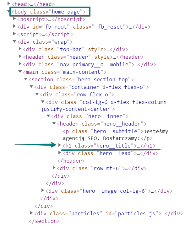
The above-mentioned titles and subtitles are found in the <body> section of the content and are also known as header tags.
When you use them, you differentiate selected pieces of content, usually by making the font bigger and bolded. Thanks to that, users find it easier to notice the most important details on the website and to get a general idea of what the content is going to be about. This, in turn, facilitates website navigation.
The Efficient Website Header Structure – What Does it Look Like?
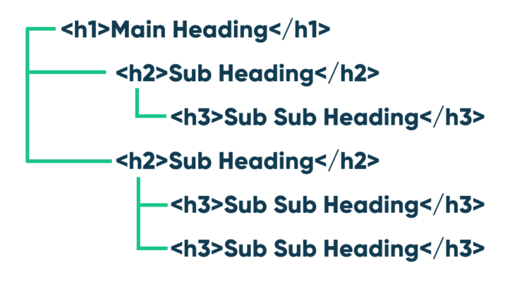
We can distinguish 6 types of headers found on a website [H1-H6].
The H1 is the most significant website header and it’s followed by 2 H2 headers, 3 H3, 4 H4, 5 H5, and 6 H6 ones. Obviously, you don’t need to use the whole range of headers, it’s much more important to keep the structure and the right order.
The H1 header is used only once as a page or article title, and it plays a chief role in SEO and user experience.
Then, we have the H2 headers which either define categories or are subtitles.
The H3 headers will come in handy when you’ll need to enter separate paragraphs that discuss given aspects of the H2 header. Thanks to them, the content is highlighted and more visible.
The H4-H6 headers are among the least frequently used ones, as in most cases there’s no need for such distinctions.
The number of H1 and H2 headers depends on the structure of a given website. Sometimes the design of a page itself suggests using 2 H1 headers, for example, the first one in the top section of the page and the second one as the opening of a new section.
The ball is in your court, just remember to make your design logical and well-thought-out.
3 Elements You Should Include in a Website Header
Website headers are crucial as they navigate not only users but also Google robots, which can check what kind of content is found on a page and what it’s about. Thus, appropriately chosen headers have a great influence on website SEO.
How to design good website headers?
First, try to determine which keywords correspond to a given subpage and make use of them while designing your headers.
Pay particular attention to the H1 tag because it’s the most important one which defines the structure of the entire page. Therefore, it’s a good idea to complement this tag with a phrase that matches the content of the page and which position in the search engine you want to improve.
Below you can see a list of three exemplary elements you can include in your website header:
Business Name
A proper website header should include the most important information about the website.
Therefore, it’s natural that you can incorporate the business name into the H1 header. Thanks to it, your company name will attract users’ attention, helping you boost your brand recognition.
Logo
Placing your company logo, or identifier in the header will help users remember it for longer.
A logo and the H1 header are elements first seen by website visitors, therefore, designing a unique logo gives you a chance to gain a competitive edge over your market rivals and helps you improve your brand recognition.
Call to Action
An eye-catchy logo and user-friendly website navigation help to attract users’ attention, but it’s not enough to encourage visitors to take action.
To achieve your business goals, you should include a CTA in the header to help users understand what direction they should follow.
If you decide to place a call to action in the header, make sure that it’s well visible, and transparent.
6 Best Website Header Design Practices
When designing your website headers, follow a few good practices that will allow you to meet the expectations of both users and Google robots.
Size and a Style of Font
It’s crucial to select a font size and style that is not only big enough but also transparent and coherent with your website design. Most popular font sizes vary from 18 to 29 pixels, but this is only a suggestion you can follow.
Analyze your website template to choose an option that best suits your design. Keep your headers visible, but don’t exaggerate – they shouldn’t cover the entire page.
Consistent Design
This point is somehow related to the aspect mentioned above.
Your header structure should be consistent not only with the entire website content and design but also with the remaining text on the page.
Therefore, if you decide to apply a particular font in the H1 header, use the same style in H2, and H3 tags. This way, you’ll present yourself as a diligent person who cares about details.
Headers with a Message
Make sure that your headers are meaningful, avoid empty slogans or clickbaits. Both users and Google robots will quickly realize that you’re trying to trick them. This will have a negative impact on your SEO process and brand recognition.
It’s a good idea to summarize the content of a given paragraph in the header.
If you’re writing a blog entry, use headers to ask questions, and provide answers to these questions in individual paragraphs.
Make sure that your headers include important keywords. This way, you’ll increase your positions for these phrases and users will be able to easily scan your content to find information that’s of interest to them.
Add an Illustration or Animation
Adding a minimalistic illustration or animation to your header can make it visually appealing.
If you want to engage users, you need to use solutions that stand out from the crowd. A graphic with important information or a CTA may encourage your website visitors to stay on the page for longer. Moreover, Google loves diversified content, so this form may support your SEO.
Add a Video
You can create video headers by uploading files directly to your website. Such a header will loop on your site, without sound. It’s a powerful tool as users love video content.
It’s estimated that even 72% of people prefer learning about services or products from a video to reading a long block of text.
Also, videos are a great way to increase your website traffic and keep users on the page for longer.
Add a Good Call to Action
Headers should intrigue users and motivate them to take specific steps.
Make sure that your website headers include a relevant call to action, complemented with a keyword that will inspire visitors to check out your offer, sign up for a newsletter, fill in a contact form, or finalize transactions. The sky’s the limit here.
Think about your business goals and come up with catchy phrases that may help you achieve them.
Innovative Website Headers
There are a few cutting-edge header ideas that may take your website to the next level. Therefore, if you aren’t sure which option is the best for your business, check out some inspirations listed below:
Fixed Website Header
A fixed website header (the so-called sticky website header) is an intelligent navigational tool thanks to which your website header is constantly displayed at the top of the site, even when users scroll it up and down.
In recent years, fixed headers have been gaining increasing popularity among web developers, and they can be created by using JavaScript, CSS, WordPress, and other similar platforms.
It’s worth choosing this solution if you want to expose your website header and ensure that it’s constantly displayed to users.
The header on Delante’s website is fixed. Pay attention to how it follows when you scroll through the website. At any time you can choose a different subpage and you don’t have to scroll all the way back up to do so!
Hidden Navigation
Hidden navigation, also known as the hamburger menu, means that main navigational links are hidden under icons or buttons. Therefore, if users want to see the menu, they first need to take action and click these icons or buttons.
Although hidden navigation can help you save precious space on your page, it may have a negative impact on the user experience.
In this case, people visiting your website are less likely to explore individual subpages as they simply can’t see them and may find it harder to access them. Browsing pages with a hamburger menu may be particularly onerous on mobile devices, so before implementing this solution, think about its potential impact on your business.
Shrinking Website Header
Shrinking header is a solution thanks to which your website header gets smaller when visitors scroll down the page.
So, if you set the default value of your header as 0.7, this element will shrink to 70% of its initial size. Apart from making your website look more professional, shrinking headers are a great way to obtain more space for valuable content.
Moreover, they draw users’ attention to the text on your website, as headers are no longer the biggest elements that catch the eye. At the same time, users have constant access to the navigation menu, which means that they can comfortably move around the site.
Shrinking headers are the recipe for getting the best of both worlds. They allow you to make your page more spacious, and transparent while helping potential customers easily navigate the website, and access all elements that are of interest to them.
Mobile Header
Since more and more people browse the internet on mobile devices, it’s crucial to ensure that your website looks good both on smartphones and desktop computers. This is when mobile headers come in handy.
When users access a website via their mobile devices, your custom, desktop header is automatically replaced by its mobile version that displays only the logo and a menu toggle with navigation.
Therefore, it’s worth modifying your settings to adapt your menu and header style to your needs and to help users move around the site. As you can see below, Delante’s website looks quite different on mobile than on desktop. This is to ensure a smooth and user-friendly experience for anyone who prefers browsing on mobile devices.
Website Headers – The Takeaway
Website headers are one of the most important elements often underestimated by site owners. Apart from attracting the attention of users and encouraging them to stay on the page for longer, they facilitate navigation and help Google robots understand your content better.
There are numerous advanced solutions you can use to refine your headers to ensure that they serve their purpose and correspond to your page design.
Take advantage of available options to make your website stand out from the crowd and to gain a competitive edge over your market rivals. If you aren’t sure how to implement changes, or which header type will work best for you, consult our specialists, we can help you get the best out of your websites’ headers!
This is an update of an article published in 2019.


![Increase website engagement by making your website mobile friendly]](png/mobile-friendly-750x532-2.png)


