How to Design Perfect CTAs?

The main goal of CTA (Call to Action) is to encourage users to interact. So how to design perfect CTAs that will improve your conversion rate? Especially for our readers we’ve prepared a guideline discussing the secrets of Call To Action buttons. Keep reading and see what elements you should focus on!
CTA – what is it?
Every website supposed to encourage users to take action should be intuitive and visually appealing. From the very outset, potential customers need to know what steps to take to convert. That’s when CTA buttons, which can be considered a kind of signposts, come in handy.
Such a message is usually expressed with the use of imperative sentences. Exemplary CTA buttons are “get now!”, “add to your shopping cart!” or, as in the case of our website, “get a quote”. It’s extremely important to make sure that users know what’s going to happen after clicking on the button.

CTA buttons are often the turning point of the user’s interaction on the site. Clicking on the message is a conscious decision that can be considered a conversion. It’s worth noting that the vast majority of your website visitors don’t convert. Although there might be many reasons, it often happens that potential customers or clients don’t know what to do or what to click on. That’s why it’s essential to design appropriate CTAs that inspire users to take specific steps on your website.
Obviously, there are several ways of designing your Call To Action. Attractive buttons that are supposed to catch users’ eyes belong to the group of the most popular solutions. However, a link placed in a text, text itself, phone number, or email address is also considered CTAs.
How to effectively use CTAs?
As it’s been already noted, buttons are the most popular form of CTAs. So why is it advisable to choose this particular solution? Well:
- buttons are clearly visible and are placed in the specific area of the website,
- they contain catchy phrases that attract attention and encourage to take action,
- thanks to various shapes, CTA buttons stand out from the website content,
- the form of buttons itself encourages users to click.
Applying CTA buttons aims at two main responses. First of all, it’s supposed to attract the attention of your website visitors. Second of all, it should convince them to take certain steps. Remember that these two responses need to complement one another, therefore, a huge button on the page won’t bring you any benefits unless it contains a really catchy and appealing text. At the other end of the spectrum, even the greatest text won’t catch the eye if the button is too small or doesn’t contrast with the website design.
So where to place your CTA buttons? Locate them in a visible place, make them comparatively big and ensure that they stand out from the rest of your website content. The message itself is also important. Consider offering users certain benefits that will certainly intrigue them even more! What about a free ebook or a discount code?
Characteristics of CTA buttons that convert
Do you want to design highly-effective CTA buttons but aren’t actually sure what are the key elements you should focus on? Don’t worry! We’ve prepared a few tips that will certainly help you facilitate the process.
● Size matters
Well, I’m not going to reinvent the wheel by saying that the bigger the website element, the greater the chance that users will notice it. Adjust the CTA size to the website so that it doesn’t look unnatural but at the same time attracts the attention of users.

● Contrast is the key to success
Do you want to “call” potential customers to action? Use a contrasting color that will catch the eye to make your CTA button stand out from other website elements. Red buttons are often used in messages informing about sales as they attract users’ attention. Although yellow is easily noticeable, it’s generally associated with joy and optimism.
The button’s edge should also be clearly visible. Moreover, bright and free space around CTAs also increases their visibility.

● Proper location
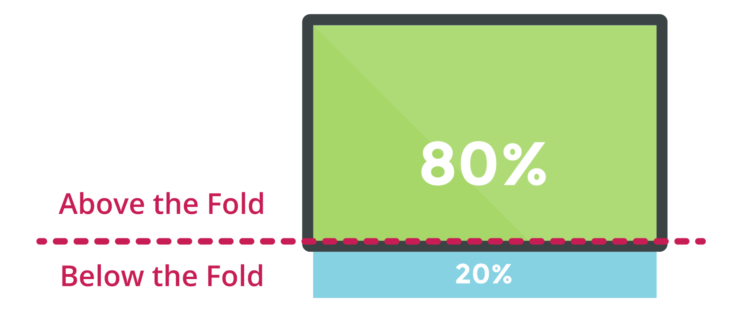
The proper location of your CTA button is a must-have. Call To Action should be placed above the fold of your mailing or website.
The conclusions of the study by scientist Jakob Nielsen, who published “F-Shaped Pattern For Reading Web Content” turn out to be extremely helpful. According to the study, most users analyze website content in a way that resembles the letter F. Remember that users don’t start their visit to your site from reading everything from cover to cover to learn about the most important elements. Consequently, the left side of the text is read much more frequently than the right side and the top of the page is considered to be more important than its bottom.
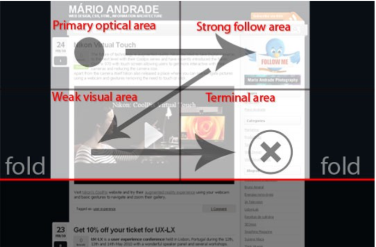
The Gutenberg diagram is another useful scheme for locating your CTA buttons. It shows reading patterns in Western countries, including Poland. There is one conclusion: we read from left to right and from top to bottom. According to the diagram, the upper left corner of the website enjoys the greatest interest, therefore, it’s also the most suitable place for CTA buttons. Contrary, the lower-left corner is the least popular.
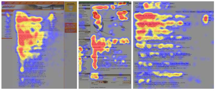
If you want to adjust the location of your CTA button to your website, use the free Hotjar program. With its use, you’ll be able to analyze user behavior or cursor moves and find out which elements attract the attention of your website visitors. All of these thanks to a heat map. This will give you a clear indication where to put your CTA button.
● Content that inspires action
As it’s been noted, the message itself is an extremely important constituent of CTAs. Make sure that the text on your button encourages users to click on it. As an example, on our website you can find CTAs offering a free ebook.
How to create effective CTA messages? Use verbs like “get”, “read”, “order”. Think like your customers. Use words in the 1st person singular and show users the benefits (things or values) of interaction. As you probably know, emotions play a great role in the shopping process as very frequently people buy impulsively. That’s why CTAs should arouse curiosity or excitement.
As you may guess, when it comes to CTA buttons, the first impression counts. Only a few seconds pass between the moment users look at the CTA and decide to click on it. The recipient should intuitively click on the button without thinking too much. Are you wondering how many CTA buttons will be enough? Obviously, it depends. Take into consideration elements such as website size or objective. Designing too many CTA buttons can upset users and make them feel lost. And we assume that it’s not your goal. After all, you want to attract users’ attention and motivate them to take a certain action.
While designing your CTAs take into account the fact that users might be using various devices to browse your website. Remember about laptops, mobile phones or tablets. Each of these devices has a different screen size and operating system, therefore, it’s essential to take all possibilities into consideration. Obviously it’d be perfect if you could check whether your CTA displays well on every abovementioned device.
Testing the effectiveness of your CTAs
The mere design of a CTA button doesn’t guarantee success. Monitor and check whether the buttons placed on your website convert and bring the intended results. How to do it? Well, the possibilities are almost endless.
In the case of advertisements or email marketing, it’s advisable to focus on the click-through-rate. This indicates the ratio of clicks to impressions. If you want to measure the effectiveness of CTAs on your website (in an article or post), you can do it by marking Call To Action links. Thanks to it, proper parameters will be assigned to them and CTAs will be defined as objectives in Google Analytics, therefore, clicking on them will indicate a completed action, namely conversion.
This way, you can assess the effectiveness of your CTA buttons. With this tool, you’ll be able to see how many times a given CTA has been clicked on. When a website visitor performs an action defined as objective, Google Analytics registers it as conversion.
Don’t give up and be patient! It’s a good idea to try out different CTA versions and forms. By trial and error, you’ll finally find the perfect and most effective solution.
Now you’re ready to design your perfect CTAs. Remember about the importance of the first impression. Make use of the tips described in today’s entry. Inform users about the potential benefits of clicking on the CTA button. Your Call To Action should be designed in a way that clearly suggests visitors what to expect. This will allow you to gain new converting customers or clients.


