How to Create Professional Graphics? Secrets of GDN Banners

How to design image advertisements that attract users’ attention, break through the information overload and banner blindness? This is a moment when all the information concerning basic graphic rules comes in handy. In today’s article you’ll learn how to create effective online graphics, tailored particularly to GDN banners in Google Ads. Keep reading!
- A brief introduction to online advertising
- Display ads in Google Ads – what are they?
- Technical guidelines for GDN advertising
- How colors affect the recipient?
- Take advantage of the empty space
- Image cropping
- Image composition
- A brief introduction to photography – light, tripod, perspective, scenery, format
- How to create GDN graphics?
- Ads blocked by users
- Banner blindness
- The psychology of advertising
- Free graphic design tools
A brief introduction to online advertising and GDN ads
As reported by IAB Poland, in 2018 there was a noticeable increase in investment in online advertising when compared to the preceding year. The value of online advertising reached PLN 4.5 billion, out of which display ads constituted PLN 2.2 billion. Image ads constituted as much as 49.6% of all the supported formats. Search engine advertising was second in the ranking (31.7%) and online ads (15.3%) came third.
Simultaneously, it’s possible to observe the growing popularity of mobile devices, their use increased by 35% when compared to the previous year. Mobile devices were also one of the main factors that contributed to a 60% increase in advertising spend.
Programmatic, video and social media advertising also recorded an upward trend.
Display ads in Google Ads – what are they?
The term display ads can be misleading as these advertisements don’t refer solely to image ads but also to text, video, and multimedia advertising creatives.
Impressive reach and accurate targeting are two main factors that make display ads stand out from other forms of promotion. This is mainly due to the fact that these ads are displayed on websites belonging to the Google Display Network which comprises several million pages and is constantly expanding.
>GDN ads aim both at improving sales and building brand image or awareness.
GDN ads can be also targeted at specific websites, this way, they’re shown on pages operating in a similar industry or discussing the same aspects as your company does.
Moreover, it’s also possible to take advantage of the remarketing possibilities of display campaigns which will allow you to reach users who have already visited your shop, put the product in the cart, or converted.
In today’s entry, we’ll spill the beans and share with you some useful tips concerning the design of static graphics applied in classic digital advertising.
And what about Google?
If you’re about to create your first image ads or you’re just writing an email to your graphic designer, hold on a second and read a few pieces of advice we’ve prepared for you.
When designing images, it’s worth paying attention to the guidelines published by the Mountain View giant. Otherwise, your ads can be rejected which would be truly horrendous taking into account the time spent by you, your employee or a graphic designer to prepare the image ad. Therefore, it’s advisable to read Google image ad requirements or at least send them to a person responsible for creating your graphics. Below, there’s a concise list of the most important requirements:
First of all: image quality of GDN ads. This field covers a number of guidelines related to aspects like:
- vertical image ads – users shouldn’t be forced to rotate their screens to identify and see ads,
- clear recognizable images, without visible pixels,
- legible text with appropriate size and font,
- applied elements shouldn’t be strobing, flashing or otherwise distracting,
- the ad size should comply with the rules – ads mustn’t take up the whole space of the page.
Second of all: your GDN ads should be relevant, meaning they should refer to your brand or products and services on your offer.
Thirdly, advertisements shouldn’t be misleading. It’s forbidden to use images whose design resembles warnings or error messages. Moreover, Google doesn’t approve ads suggesting that the displayed ad isn’t a single creative.
Fourthly, due to the diversity of Internet users, your ads shouldn’t display any adult content. This applies equally to text, images and sounds. It’s forbidden to:
- show sexual acts, especially those promoting underage or other illegal sexual activities,
- advertise content that might be seen as a promotion of sexual acts in exchange for money,
- promote the sexual exploitation of children,
- promote marriages for foreigners.
Exceptions to this point are thoroughly described in Google Support.
Technical guidelines for GDN advertising
Google Support clearly outlines the requirements concerning acceptable sizes and formats of published display ads. Due to the fact that we’ve already addressed this issue in one of our previous articles, which you can read any time you wish, now we’re going to move on to the merits of the case, aka guidelines discussing how to create image ads.
How colors affect the recipient?
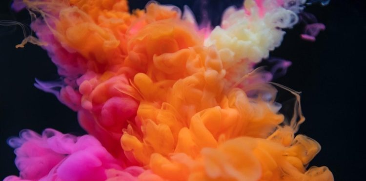
Our discussion about graphics should start with such a basic issue as colors. Just for the sake of clarity of this article, let’s assume that even despite a differing meaning, the terms “hue” and “color” can be considered synonyms.
Color psychology
Color psychology is not only intriguing but also complex. It concerns issues such as the fact how a single color affects the recipient, how a combination of several colors is received or what’s the difference in the color’s reception depending on the hue, brightness, and saturation. Here, aspects like culture in which the recipient was raised (discussed in more detail later on), as well as the context of applying given colors in graphics, typography, and text message, also come into play.
Colors in advertising
As you’ve probably learned in your physics lessons, any color is a light beam received by our eyes and processed by the brain.
Terms and the color wheel
Let’s start by pointing out the differences between the previously mentioned terms:
- A hue concerns the name given to a color – e.g. green, red, purple.
- Brightness helps to estimate the lightness or darkness of a given color.
At this point, it’s worth noticing that the reception of the brightness of a particular color is strongly determined by its surroundings. For example, a light square on a black background will seem brighter than the same square on a grey (lighter) background.

- Saturation addresses the intensity of a hue. As an example, the sky is bluer on a bright day than on a cloudy day when it’s more blue-gray.
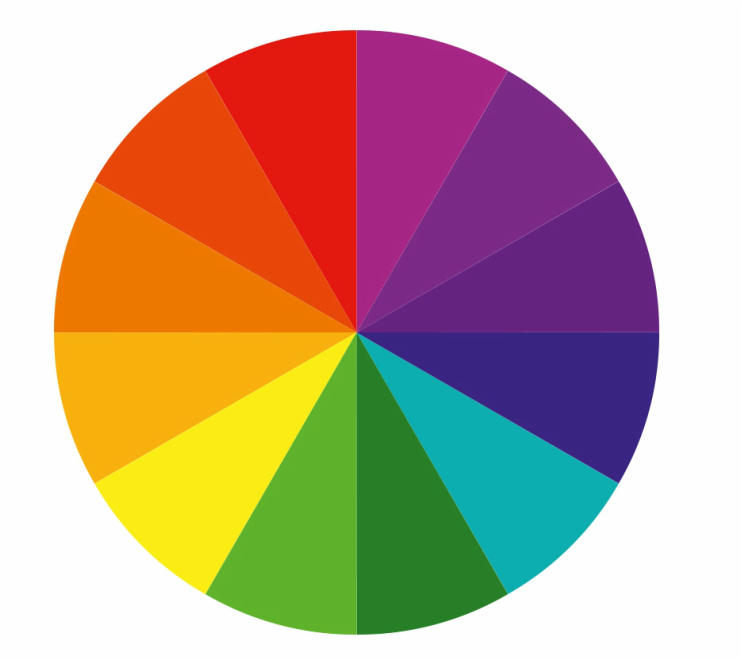
It’s a common knowledge that mixing colors enables obtaining even more colors. Therefore, red combined with blue gives purple, whereas yellow mixed with blue gives green. And these kinds of relationships are depicted in a typical color wheel.
Warm colors, from green to red, are all shades associated with positive feelings. On the other hand, cool shades like dark green, blue or purple, are usually calm and connotated with sadness.
There are plenty of methods of mixing colors, nevertheless, the most commonly used shades include:
- monochromatic, namely the use of one color whose saturation and brightness differ.
- analog, meaning mixing neighboring colors in the color wheel.
If you select blue as the main color, its neighboring shades include dark green and navy bluish. Such a combination is a relatively safe solution as this way it’s almost infeasible to choose colors that don’t match. At the same time, this mix is particularly eye-pleasing mainly due to the fact that it can be encountered in nature.
When choosing this method, go for three colors thanks to which you’ll get a dominant, complementary, and accentuating shade. This solution is particularly beneficial as thanks to it you’re unrestrained while creating your images and at the same time you remain faithful to the selected colors.
Our company, whose logo and motif are green and teal, is a perfect example of the application of analogous colors.

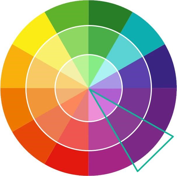
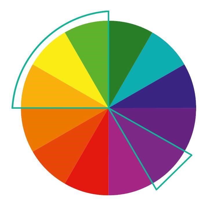
- complementary – colors at the opposite sides of the color wheel such as red-green or yellow-purple.
If you’re just beginning your adventure with graphics, we wouldn’t recommend you to use this contrasting combination as its improper application can be irritating and too bold for the recipient. However, if you decide to apply this solution anyway, remember to adjust the brightness and saturation accordingly.
These colors are usually the most optimal solution for small banners supposed to catch people’s attention as the size of the advertising space also has a significant impact on the final reception of the applied colors.
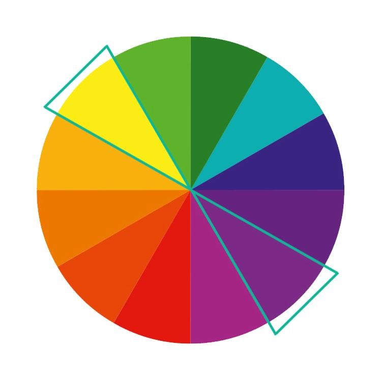
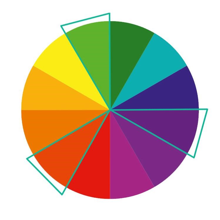
- split complementary colors – this mix resembles the abovementioned one. Select the main colors and the neighboring shades from the opposite side of the wheel. This method is also more universal than the previously discussed one, therefore, you can use it to obtain the right contrast and at the same time maintain the appropriate color harmony.
- triadic colors – which means the application of three colors that are evenly spaced on the color wheel. Impressive as it may be, this combination is rather troublesome, unless one of the colors is your base and the remaining ones are used just to accentuate the whole graphics.
- tetradic colors – are a variation of triadic colors. This time you select four evenly spaced colors. This method can be compared to a mix of two complementary colors (meaning those on the opposite sides of the wheel).

When it comes to this solution, it’s advisable to select one dominant color as applying the same amount of four colors can be too overwhelming for the recipient.
The meaning of colors
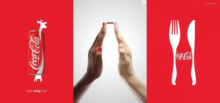
What can your advertising gain from using colors consciously? Well, thanks to it you can attract recipients’ attention, make sure that your creatives are memorable, and that apart from the text message they also communicate specific feelings. Moreover, if you choose the same color range each time, your images will certainly get engraved in memory of the recipients. Just think about Coca-Cola and red prevailing in its campaigns or McDonald’s and its yellow-red color combinations.
Still, it’s worth remembering that every color can evoke both positive and negative associations. Think of yellow, on the one hand, it denotes a warm shade connected to summer but on the other, it can be perceived as a warning sign indicating something dangerous.
When it comes to advertising creatives, applied colors should be strongly related to the company image, shades used in the logo, on the website or in other media. Therefore, you should start by taking a closer look at the visual brand identity of your company which will certainly facilitate your work. After all, the ad hoc change of concepts that accompanied the brand building of your business isn’t always a good idea.
The range of selected colors also needs to be tailored to the target group.
Below you can see a list of associations with the basic color palette.

Yellow. According to research, it symbolizes not only warmth, serenity, joy, and optimism but also caution and warnings. It also enhances remembering the content.
Indeed, McDonald’s logo refers to joy and a positive attitude.
Yellow is recommended for all companies, such as travel agencies, which care about the efficiency of consumer decisions. Try to remain moderate as too much yellow can be irritating to the eyes.

Orange as a mix of yellow and red is a combination of associations connected to both colors. It’s closely related to joy, activity and energy, evokes the image of the sunset and, due to its connotation to the fruit, whets the appetite. At the same time, this shade is lighter than red, therefore, it’s frequently perceived more positively. Look at Fanta which applies orange to perfectly mix youth and joy.
Orange is often used in alerts and website notifications. It’s recommended for companies wanting to reach young recipients and aiming to inspire joy and enthusiasm.

Pink is an energetic color. Lighter shades are associated with care and sentiment, moreover, they’re girlish.
It’s commonly applied by brands for children and teenagers.

Due to its physical properties, red is considered to be the most stimulating color. It’s associated with warmth, love, passion, and desire. Moreover, red is linked to energy, fire, and dynamics, combined with danger and fierceness.
Just think how strongly Coca-Cola and its red logo influence the recipients by matching the color with the qualities of the drink.
When it comes to advertising creatives, red is frequently used in CTA, namely buttons, discounts, and sales offers as well as all notifications that are supposed to immediately draw users’ attention.
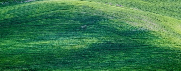
Green is associated primarily with nature and consequently ecology, cleanliness, peace but also disease or guilt. Due to the color of the American dollar, it can be linked to money.
It’s frequently applied to emphasize success, trust or acceptance and it’s recommended mainly for brands from the eco and health industries.

Blue is the color of the sky, water, nature, and cold (including cold calculation), ice, or sadness. Thanks to the neutral character, blue looks well when combined with other shades.
Using this color in the text usually indicates linking.
Due to the fact that blue accentuates professionalism and inspires trust, it’s frequently applied in the financial and insurance industries as well as business and technology sectors. Because of the fact that it’s derived from road signs, blue is frequently used in social media and graphics serving the informative purpose.

Purple is associated mainly with divine symbols as traditional liturgical garments denoting dignity and mysticism are usually in this shade. In the past, the process of obtaining purple cost an arm and a leg, therefore, the color is also connotated with nobility or luxury. Simultaneously, it may allude to magic, darkness, and profound sadness.
This color is often applied in the creative industries, mainly due to its strongly inspiring connotations. In 2019, purple was the main theme of the marketing communication of the Confiction Pop Culture Festival in Krakow.

Brown, as a color, doesn’t evoke any emotions, therefore, it’s frequently used only as a complementary shade. Obviously, it’s willingly applied by manufacturers of chocolate, coffee, or chocolaty products. Consequently, it’s associated with the warmth and comfort of home or relaxation. However, these aren’t the only emotions it arouses.
Thanks to its closeness to nature, it indicates safety and stability which can be seen in the logo of UPS, a package delivery company.
Brown is also applied in advertisements for organic, natural, and more luxurious products.

Because of the neutral meaning, black is frequently applied and serves as a means of accentuating high quality, workmanship, and elegance. It’s also associated with death – mourning, funeral, depression, and sadness.
Before using black in any of your creatives, you should thoroughly analyze what target group you wish to reach. Seeming elegance can scare off potential customers who may consider your products to be too luxurious for them. However, there is a solution to this issue, you can contrast the color with another shade or a lighter element like graphics or typography. But why? As black matches all remaining colors, it’s perfect to accentuate the dynamism of the complementary color and to draw attention to the depicted elements.
Nevertheless, you should be careful when it comes to combining black and white, especially if only small elements or decorations are supposed to be white. Such a combination is usually associated with hourglasses and funeral parlors.
Black is used by premium brands, funeral parlors, and companies that want to exhibit their dynamism and luxury.

White is a shade obtained by combining all existing colors. Its values in the RGB space are 255, 255, 255 and in the CMYK color model – 0.
In European culture, white is associated mainly with innocence, purity, winter, and honesty. At the same time, the color accentuates chicness and professionalism, as seen when looking at the design of Apple’s products. The combination of white and black is probably the most classic mix ever.
It’s worth pointing out that this shade is received completely differently in the Asian culture where white is connotated with mourning, death, and funerals.
When it comes to European culture, white will be perfect for advertising quality products. It’s commonly chosen by brands from the medical and cosmetic industries as well as technologies that place emphasis on simplicity and minimalism. Using white as a background of the creative will allow you to optically expand the space.
If you operate in the modeling industry, consider using a white background as it suggests innocence and doesn’t foreground the sexuality of the models. Dove’s campaigns are tangible evidence for that. Nonetheless, it has to be borne in mind that black and white are usually applied to fight racism, so they need to be used responsibly.

Grey is a neutral color that doesn’t evoke any particular associations. At the same time, it’s ideal in situations when you want to accent the elegance of the creative or use it only as a complementary color that helps to emphasize the main shade.
Combining colors
Ok, but how to combine colors so that they constitute a harmonious whole? First and foremost, be reasonable. Images should be legible and transparent, therefore, there needs to be appropriate contrast between particular colors. While letters aren’t supposed to intermingle with a bright background or ornaments of the creative.
Yet, it should be remembered that recipients appreciate moderate contrast. A wrong combination of intensely bright colors can be really irritating and inconvenient to look at and as we assume, you want to spare your recipients from such unpleasant experiences.
It’s best to place the text on a uniform background without any textures or shadows. By the way, shadows haven’t been applied in typography for quite a long time, so it’s better to avoid them. Keep in mind that a combination of colors may look totally different than individual shades separately, what we’ve already mentioned before while writing about the white square on the black and gray backgrounds.
Below you can see an exemplary ad whose background successfully decreases the transparency and legibility of the message:
The 80-20 and 60-30-10 rules
In graphics, it’s often possible to encounter the so-called safe 80-20 and 60-30-10 rules for using colors. But what do they mean?
The first rule applies to the use of two colors. The dominant shade constitutes 80% of the creative, while the complementary, often contrasting, color amounts for 20%.
The latter rule denotes that the main color should constitute 60% of the image, the complementary one 30%, and the remaining 10% should be contrasting buttons, slogans, and other elements that are supposed to stand out from the rest.
Color scheme designers
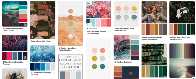
If you don’t feel confident when it comes to selecting appropriate colors for your creative, you can take advantage of numerous apps and tools that will allow you to tailor your color palette to the objective. There are also plenty of ready-made mood boards available online. It’s worth applying them to make sure that all the colors are used properly. The selection of color schemes is a troublesome task even for many graphic designers.
Exemplary helpful tools and programs include:
- Adobe Color CC – used to create color sets, browse through the suggestions available in the database and download ready-made items.
- Paletton – a color scheme designer operating since 2002.
- Colordot – a page that allows you to select the appropriate shade only with the use of your mouse. It provides the HEX values (#…) and allows you to select a few colors at the same time. It’s also possible to see whether the chosen shades match each other or not.
- Pinterest – offers a wide range of boards with ready-made color sets and mood boards.
Culture vs. color perception
The way given colors are perceived in a particular culture, meaning the place where the recipient was brought up, is also extremely important. Below we’ll discuss only three shades, however, you need to remember that there are many more such examples.
Whereas in European countries white is perceived as a symbol of innocence and purity, mainly due to the prevalence of Christianity, in the Eastern culture, it’s connotated with death and mourning. Moreover, in Japan, white is a symbol of youth and gullibility.
Black is another controversial shade. In Europe, it denotes both death and chicness, while in China, it’s associated with the joy of boys. Additionally, for Indians and Egyptians, this shade is an embodiment of the soil and consequently abundance. On the other hand, the Japanese perceive it as a symbol of maturity and nobility.
Red represents a whole range of feelings, from love to hatred and even grief. In the European culture, it’s associated with love, excitement as well as revolution and communism. Followingly, South Africa equates it with bloodshed and consequently mourning and anger. Moreover, the Japanese also treat it as a symbol of grief.
How do visually impaired people perceive colors?
It’s worth remembering about numerous recipients of your ads who struggle with various visual impairments such as Daltonism which notably restricts the perception of given colors. Facebook whose color scheme is maintained in shades that enable Mark Zuckenberg suffering from this dysfunction to properly see the platform is the ideal example of how graphics can be adapted to all recipients.
Color perception depending on gender and age
The adaptation of colors to the recipients is the next issue. Women and men perceive color combinations differently. While men generally prefer juicy, vivid shades, women are fond of subtle, pastel colors.
The age of your recipients can be another hindrance. Elderly users may favor subdued shades taken from the cool part of the color wheel, whereas young people enjoy the warm side more.
CTA buttons
As you know, Call To Action is frequently used in GDN ads. Make sure that your buttons are in a distinct color that stands out from the rest and stimulates recipients. Try to avoid pastel shades, unless the contrasting colors don’t match your company image. Take a look at our advert below.

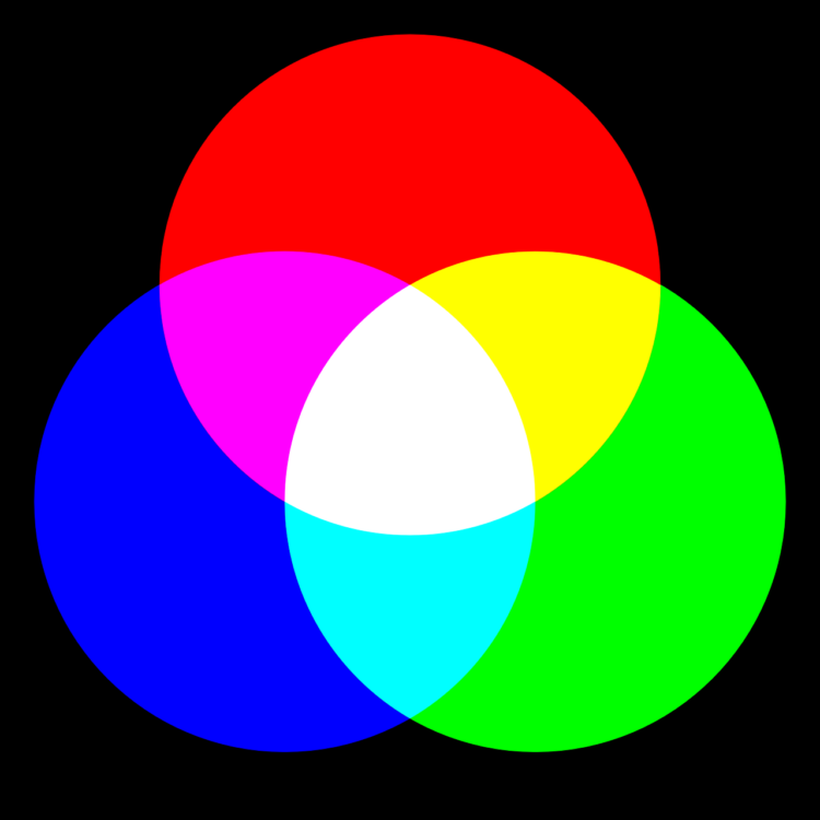
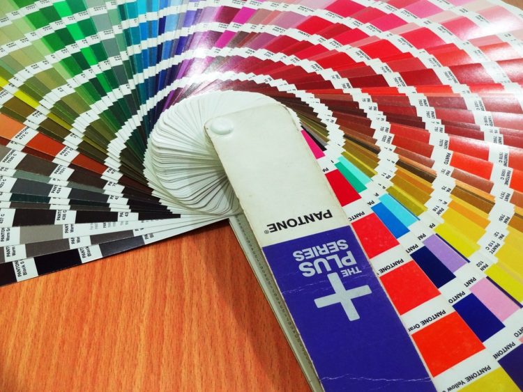
Color spaces
When discussing colors, it’s necessary to dispel any doubts concerning the RGB, CMYK, or Pantone color spaces.
If you create online advertisements such as GDN ads in Google Ads, all you need is the RGB color space used to display graphics on screens. It comprises three colors: green, red, and blue.
Unfortunately, if you’d like to print your digital design, you won’t be able to obtain the same colors as the ones displayed on the screen. What’s more, every screen displays colors slightly differently so take it into consideration while designing your creatives.
CMYK refers to four shades used in color printing. The color is obtained by applying 4 layers of transparent printing inks in different proportions. These inks usually include cyan, magenta, yellow and key color (usually black).
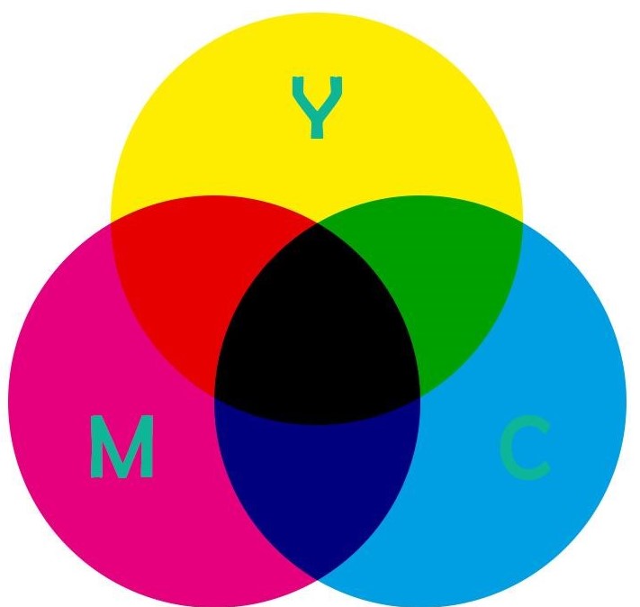
At the other end of the spectrum, Pantone is a special color (printing) palette designed by an American company with the same name. The main advantage of Pantone is the possibility of obtaining identical colors on every printed medium, which isn’t feasible with the use of CMYK. Moreover, dissimilarly to the previously mentioned method, when it comes to Pantone, the ink is applied as one color, therefore, there are no color shifts (e.g. on narrow elements) during printing. Pantone is also the only palette with metallic colors, gilding or refining.
And that’s the end as far as ad colors are concerned. Hopefully, the provided information will come in handy one day. Now it’s time to discuss further constituents of creatives and image ads. Ready? Let’s get down to it!
Take advantage of the empty space
People who don’t operate in the creative industries often perceive empty space as waste, however, they can’t be further from the truth. The so-called whitespace is an extremely valuable part of every advertising creative. But let’s start by defining the empty space in the world of graphic design.
The empty space originates from painting and denotes negative space, meaning the space between particular elements that constitute the creative.
But why is it so important? There are a few reasons:
- it positively affects UX (User Experience),
- reduces the number of distractions in the graphics,
- separates unrelated elements,
- indicates which part of the creative should attract the recipient’s attention,
- accentuates the CTA buttons,
- improves aesthetics,
- remains in line with the currently fashionable minimalism.
We use the term “empty space” deliberately so that you’re not misled by the “whitespace”. Indeed, whitespace is empty but it doesn’t necessarily have to be white, it comes in different colors and patterns, moreover, it can be based on a photo or graphics. As an example, let’s take a look at the creative found online:
Where to apply it?
Whitespace consists of margins, areas around texts and graphics, or spaces between letters and lines. Well, obviously it’s ideal when these elements match the remaining parts of your brand, including the website layout.
Below you can see a shortlist of the most important pieces of advice related to the subject:
- Apply appropriate spacing between consecutive lines of the text, so that it’s legible even for those who decide to only cast an eye over it.
- Use the empty space to accentuate the most important elements of the graphics. This is when the fashionable minimalism comes in handy. Just keep enough space between the most relevant parts of your message and get inspired by the way Apple does it in its creatives.

- Remember that elements placed close to each other are automatically perceived as a group, therefore, they’re analyzed together. In the above example, the text is one block, while the graphics constitute a separate “group”.
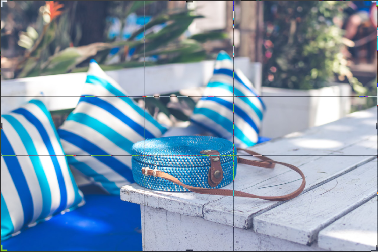
Image cropping
Image cropping – adding and deleting
There are two different methods to crop images. Both of them are approved and recommended, therefore, you can choose the option that works best for you.
The first method, which is also slightly easier, is based on choosing the most important element that the whole creative revolves around. You place solely this object in the frame and then distance the view by adding other elements. The right frame is obtained when it turns out that subsequent additions damage the perception of the image.
The second method is just the exact opposite. You begin with a wide frame and then gradually narrow it down. The right frame is obtained when each subsequent zoom, meaning the deletion of potentially unnecessary elements, damages the perception of the image.
Bird’s eye images
Bird’s eye images have recently become increasingly popular. Lifestyle, nutritional or photographic profiles on Instagram or Facebook abound in such photos. This is the so-called Flat Lay. But how to take an artistic, engaging, and organized picture? Let’s find out!

First of all, collect all items that are supposed to be shown in the photo. Then, arrange them in a proper way. The prepared arrangement is photographed from above.
Flat Lay is mostly about textures, materials, and fabrics. The objects in the photo can be arranged either disjointedly or symmetrically.
The first option involves a layout in which certain parts of elements are outside the photo, therefore, some objects are cropped and less visible. This scheme is often applied in lifestyle and cuisine photography.

The second option shows objects arranged symmetrically, collaterally, or perpendicularly to one another. This layout looks particularly attractive in the case of designer products, luxury items, or photographs that are supposed to attract recipients’ attention to a specific item, not to create a cozy atmosphere (as in the case of the first method).

Bird’s eye images are governed by the rules mentioned above – colors should be moderate, shades need to engage users, the contrast should be tailored to the image and the font ought to be legible. It’s advisable to place the advertised product in the central point of the image so that it’s immediately noticed by the recipient or in parts discussed in the section on image composition.
The central point of the image
Remember that the brightest, sharpest, biggest, or most contrasting elements of the image usually draw the recipients’ attention first.
Image composition
In this part of the article, you’ll find a list of tips from fields such as drawing, painting or photography.
Image composition comprises simply arranging elements in such a way that they interact with each other as intended by the creator.
If you aren’t sure what your ideal composition looks like, think about your objective and display only necessary elements.
If you aren’t an experienced photographer but plan to take pictures on your own, remember about minimalism. It’s harder to mess up a photo that shows fewer elements, so try to remove any unwanted items from the frame.
The harmony of the message is of key importance when it comes to image composition. Graphics shouldn’t overwhelm or distract recipients, instead, it should guide them from the most important to the least relevant parts of the creative. That’s why it’s worth getting familiar with a few basic principles that will make your photography adventure much easier.
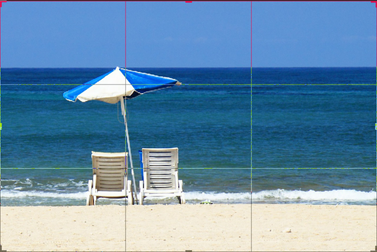
The tripartite division
This rule is the most common and approachable method of image composition. Just use straight lines to divide the image into 9 identical parts. If you’re wondering how to do it, simply insert two lines from top to bottom and two lines from left to right. Powerful focal points of your composition are located in the places where the lines cross. It’s perfect when the most important elements of your image are close to them.
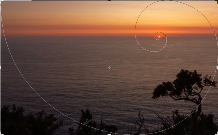
The golden ratio
The golden ratio is a solution based on mathematics. Moreover, it can be commonly encountered in nature such as in the case of the twist of a snail shell.
It’s an equation that means that the longer edge of the image should be divided in such a way that the sum of the created segments divided by the longer one would be identical to the ratio of this longer fragment to the shorter one. The Greek number φ which equals approximately 1.62 is the result of this equation.
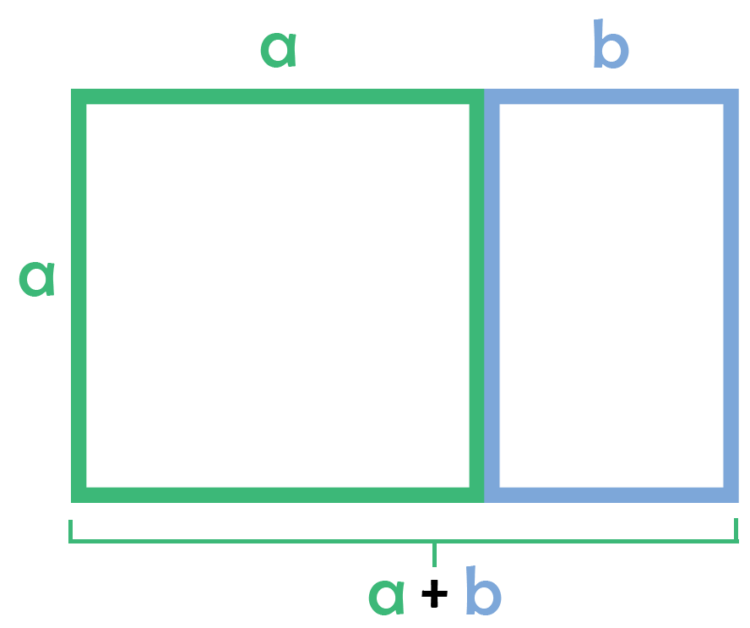
If you can’t make head nor tail of it, don’t worry. The development of technology is a huge advantage for all creators and artists. Programs or equipment usually enable setting up the golden ratio lines automatically.
The golden spiral
This rule is based on the principle discussed above. The image is divided into a large square and a vertical rectangle. The smaller rectangle you get is further subdivided into subsequent parts with quarters of circles. That’s how, when leading the line through the large square and the subdivided rectangle, you obtain the spiral.

If you work on Adobe Photoshop, then visualizations of all these solutions are available in the cropping tools section.
The frame
Many objects can be photographed with the use of surrounding frames such as windows, doors, frames, columns, building arches, spaces between branches. All you need is a pinch of creativity.

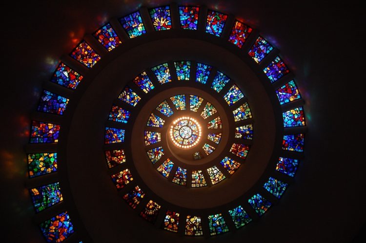
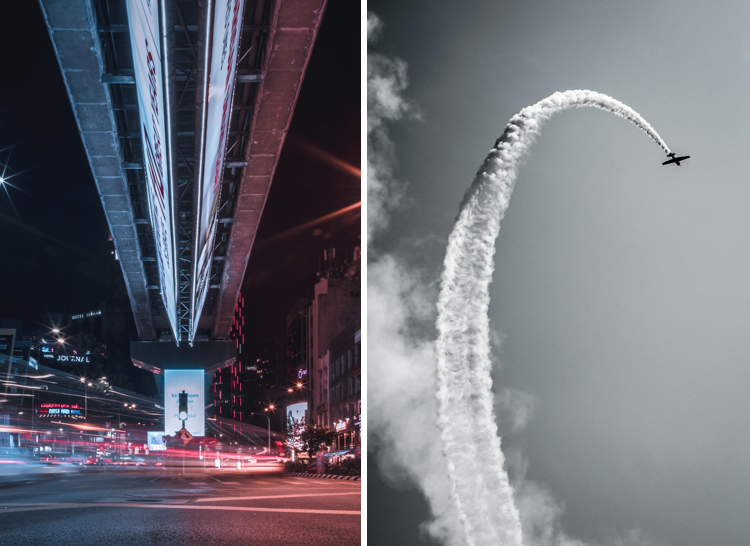
The surrounding lines
Lines present in the picture or painting are natural signposts for our eyes. You look at them unconsciously, therefore, it’s worth using them well. What are these lines? Just think about sun rays falling through stained-glass windows, streaks, smoke, footsteps on the sand, bridge lines, desk edges or stripes.
A brief introduction to photography
Product photography (the so-called packshots) and image photography (more creative one with models or products in use) are about two things – the equipment you have and the knowledge of the rules governing the world of photos.
As far as the equipment is concerned, it’s simply supposed to take quality photos. It’s also beneficial to make sure that you use a few different dedicated lenses for your camera, because then framing and other factors influencing the final look of the photo won’t be so problematic.
On the other hand, being familiar with the rules is a must if you want to take impressive or at least technically correct photos. These rules, just like in painting, determine the final outcome, therefore, it’s a good idea to get to know them.
Operating the light
Light is one of the most important factors that affect photo quality. You can take advantage of daylight or lamps that generate white light.
If you’re taking a picture of a room, remember about the windows – you need to set your camera options so that the interior is slightly underexposed and the window is gently exposed. Otherwise, you’ll either get a suitably lit center and too light window, or a dark room and a suitably lit window. Moderation is king and the missing white balance can be adjusted in a graphic editing program.
Another solution is to take HDR photos. Take several photos with different exposure settings – a lit room and a lit window – and then put them on each other in the graphic program. The technique works well in the case of landscape pictures when the sunlight falls directly into the camera lens.
The find the most optimal ISO (i.e. the indicator that determines the sensitivity of the camera sensor to light), set it between 100-200, as this will allow you to take noiseless photos (without visible pixels).
Delante’s pieces of advice
If you want to discover our two life hacks, keep reading!
When working in daylight, at home, it is worth unifying the light by scattering the rays falling through the window with the use of a transparent lace curtain or foil glued to the windows.
On the other hand, if you need white light but don’t have professional lamps at your disposal, take advantage of home-made solutions.
You can buy a usually suspended lamp with white light, set the camera for long exposure time, and then move the lamp over the object motion to get unified lighting.
It’s also possible to benefit from self-made tubes – just put a tube made of a plastic bottle painted black (a light-absorbing color) and covered with a white, thin, transparent material on a white light torch.
Tripod
Tripods make photographer’s work much easier. So if you don’t have one, you lose a lot. Thanks to a tripod, the camera remains still and your photos aren’t blurred.
However, if you don’t have a tripod, try not to touch the camera too much while taking photos. It’s best not to use the shutter button and instead take advantage of external remote control.
Delante’s pieces of advice
If you don’t have a tripod, stand in a straddle, so that your elbows are firmly fixed against your hips. This way, your posture gets more stable and you prevent any unnecessary body movements. Moreover, you can also hold your breath while taking photos.
Apart from that, you can simply put your camera on a firm surface such as a desk, counter, shelf, or a few books. When using this method, set the self-timer to avoid any unnecessary camera movements while pressing the shutter.
If you shoot a dark environment, you must set longer exposure time (so that enough light falls into the lens). You can also use a tripod – the image quality is very sensitive, even to the slightest movements.
The longer the exposure time set, the brighter the image you get. If you take photos of objects in motion, set shorter exposure time.
Perspective and lines in the picture
Take photos in such a way so that your objects are located between the horizontal or vertical lines present in the frame. Place the camera at the level of your eyesight so that the lines don’t go up or down. Although trying out different solutions can be very beneficial, the perspective affects the overall perception of the image:
- photos taken from below seem to be presenting objects that are higher than in reality,
- photos taken from above seem to show significantly smaller objects,
- elements closer to the camera lens seem bigger than objects in the background.

Take advantage of available graphic programs that will correct any line deviations.
What’s more, it’s worth remembering that due to the focal length, every lens distorts the photo, especially objects close to the frame edge.
Preparing the scenery
Contrary to what you may think, preparing or even selecting the photo scenery is a complex task. However, it’s worth mastering the skill in order not to distort the message that’s supposed to be conveyed by the photo. After all, photographs are intended to complement your advertising strategy, not to constitute a separate entity.
While taking photos, remember to:
- make sure that only essential objects are in the frame,
- keep things neat – make sure that the photographed surfaces (furniture, glass, etc.) are clean
- make the frame more stylish – arrange objects coloristically. In good pictures, even the mess is usually meticulously prepared.
- decorate the room scenery and flat lay – flowers in a vase, lights, candles, cotton balls, and other accessories make your photos more stylish and cozy. Remember about a mug or a notepad and carefully place the accessories on your desk or table.
Photo format
If your photo equipment allows you to save files in the RAW format, use it. These files provide high image quality and great editing possibilities. Moreover, they enable almost a non-invasive change of white balance and easy adjustment of lights and shadows in the picture. Yet, it needs to be borne in mind that RAWs take up a lot of disk space, and their preview isn’t possible without dedicated software (e.g. Adobe Lightroom).
How to create GDN graphics?
Now you’re familiar with all the basic rules governing the creative world, it’s time to implement them in life. Below you can see a summary of the most important steps that will facilitate the whole process. Remember that the guidelines are limited solely to technical aspects, therefore, all issues concerning emotions or creativity of your image ads are in your hands. Test your advertising creative as each group of recipients is different, therefore, it’s essential to find out which solutions work in your case.
Sizes for display ads
First and foremost, learn about the acceptable sizes for display ads. Many people neglect this step, although it’s extremely important. Trust us, it’s much easier to create properly sized graphics than to compress too big creatives later on. Why? Image compression degrades its quality, which can be recreated only if you spend a lot of time doing it. Therefore, it’s worth remembering the proper sizes and dimensions.
All available image ad sizes have been discussed in one of our previous articles and in Google Ads Help Center.
Content is king
The text of the advertisement should be persuasive and informative. What does it mean?
- it should inform the recipient of what product or service is advertised (specific sale, seasonal discount, etc.).
- it should encourage the recipient to click on the banner and go to a linked landing page – that’s when the CTA buttons come in handy.
- it should focus on the added value – the benefits the customer gains from the offer. Remember that your customer needs a nail in the wall, not a hammer.
Keep your text concise but relevant. Don’t write lengthy descriptions, online banners are rather small and you have only a few seconds to attract the recipients’ attention.
It’s a good idea to dedicate only 20% of your advertising space to the text.
Although this solution is much riskier, you can also try to meet your demanding recipients in the middle:
- Surprise your recipients – employ intriguing associations or comparisons and accentuate values that aren’t related directly to the industry (like Dove which focuses on inner beauty and self-confidence of women).
- Apply wordplay – this might be a tricky, yet very effective method of attracting users’ attention. Paraphrase well-known proverbs, quotes or sentences. At the Cannes Lions 2017 festival, Heineken’s “to beer or not to beer” was appreciated as an effective advertisement.
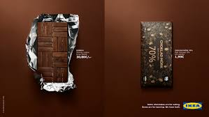
- Experiment with humor, irony, puns. An exemplary ad created by Netflix:

- Evoke positive feelings such as the warmth of the family home, the smell of dough, leisure time, etc.
- Present your product in a non-standard way, even if it turns out to be controversial. This point also assumes showing the flaws of your product to remain authentic.
While thinking about all these aspects, remember to ensure that the message of the ad is consistent with your brand. It’s pointless to be controversial if your company offers cozy or luxurious products.
Provide visible Call to Actions. Avoid creating lofty descriptions, instead, go for concise phrases that clearly indicate the content of the website the recipients are redirected to after clicking the button. Slogans like “download a free ebook”, “buy now” or “receive 15% discount” should be perfect for this purpose.
Graphics vs photos
Photos are a much more popular method of advertising brands than images. It results mainly from the fact that the creation of graphics that evoke particular feelings requires unconventional ideas and skills. When it comes to photos, they’re much more convenient because even if you don’t create your own pieces of art, you can still use publicly available free and paid stock images, you just need to remember about the copyrights.
The objective of your image ad is another issue. Sales campaigns should expose products, illustrate their assets and applications. On the other hand, image campaigns aim at inspiring brand awareness and informing people about a given product or service available in the market. They’re supposed to evoke certain associations thanks to which the recipients will see the product through the prism of a particular brand.
Select the appropriate colors of your graphics or photos. Remember about the golden rules described above, about the harmony of colors, their influence on the recipient, and moderation – sometimes less is more. Intrigue users with visible emotions, not flashing banners.
Legibility of creatives and fonts
Legibility is one of the main factors affecting the results of the creative. The font and content of a proper ad is separated from the graphics. What does it denote?
First of all, you should use maximally two different fonts. The combination of serif and non-serif or two non-serif fonts is a great solution. Try to avoid applying solely serif fonts as they aren’t displayed legibly and eye-pleasingly on every screen.
Second of all, there should be some empty space around the text so that it doesn’t interfere with the graphics. The text written on a detailed graphic or a multi-element photo may be illegible. If you want to apply such graphics, place a single-color square, rectangle or circle as a background that will separate the photo from the text.
Creating a coherent image
Your ads are supposed to create a coherent whole that takes its roots from your brand’s communication strategy. Therefore, each element applied in the ad should evoke connotations related to your brand. It’s ideal when your image ads are visually similar to your leaflets, billboards, social media graphics, shop decor, or employees’ clothes. This can be achieved by using the same fonts as the ones on the company’s website, a common color scheme, or method of presenting products or services.
Ads blocked by users
In 2018 Live Panel conducted research evaluating how many Polish Internet users block ads while browsing various websites. As a result, it can be seen that the percentage of such users is constantly growing and as many as 76% (which is 4% more when compared to the preceding year) of Polish Internet users block ads. At the same time, Poland is still one of the leading countries when it comes to the use of various ad blockers which are still applied by 38% of web visitors.
According to the research, users:
- skip ads whenever it’s possible,
- change the settings of the used browser,
- tend to purchase premium versions of the applications they use, provided that these versions are free of advertisements.
It can be also stated that more than half of the Internet users would actually look for different ways of blocking ads if Adblock was no longer available.
Interestingly, video ads are more tolerable than classic display ads. This results mainly from the fact that together with the development of the online world, the Internet got overloaded with banners which are usually less emotional than the video content.

Banner blindness
Banner blindness is another phenomenon that needs to be taken into account. Due to the fact that users are generally aware of the location of banners on websites, they automatically ignore these elements. It’s common, sometimes even subconscious, practice of every average Internet user.
Despite the phenomenon of banner blindness, graphic advertisements affect recipients, and properly prepared creatives can increase brand recognition and therefore serve their purpose.
The psychology of advertising
Psychology devotes a lot of time to discuss consumer behavior. First of all, emotions play a very significant role in the process of selecting and purchasing products. Only afterward, after buying the desired goods, customers start to analyze the purchase.
It turns out that both positive (which is quite obvious) and negative emotions affect our decision-making process. However, it’s more important to focus on the latter type as properly expressed negative feelings can evoke interest, contemplation, and consequently, a greater focus on the content. Nevertheless, remember that moderation is crucial as too much of a good thing can be harmful. Emotions that should be addressed are determined mainly by your target group. Young mums are pleased with enjoyable and relaxing adverts, while teenagers prefer more controversial or ambiguous creatives. Stating the obvious, this is just a sweeping generalization, so it’s essential to conduct a thorough analysis before implementing any solutions.
The human brain likes simplicity, therefore, when it comes to advertising, it’s worth applying the KISS rule, meaning Keep It Simple, Stupid. Your advertising creatives should present a simple, yet eye-catching image and a specific, comprehensible message. This results mainly from the constant information overload due to which recipients aren’t able to fully devote their attention to a single element.
From the psychological point of view, the reception of an advertisement can be divided into stages.
The first one is perception, meaning simply such as image or sound. Then the advertisement is processed and categorized. On the basis of its similarity to other ads products, recipients determine what’s presented in the graphics. The perception differs depending on your senses, sensitivity, common or specialist knowledge. Therefore, good advertising creative is designed to convey information and emotions.
The knowledge of the target group is essential to properly determine what messages or creatives will serve the intended purpose. Addressing elderly persons will require completely different communication forms than addressing teenagers brought up in the Internet era.
As elderly people are usually fond of classic forms of advertising and traditional values, these elements should be accentuated in your creatives. However, it’s worth noting that the senior generation constitutes the smallest group of Internet users, therefore, online ads may not be the most optimal solution in this case. At the other end of the spectrum, baby boomers are adults constantly searching for the most advantageous offers who are highly loyal to brands that turn out to be reliable.
The slightly younger generation X, i.e. people born in the 60s, 70s, and 80s of the previous century are usually consumers vulnerable to sales, coupons, and all types of discounts. They use email and social media platforms like Facebook, nevertheless, sometimes they’re overwhelmed by the constantly changing technology, therefore, their purchasing decisions are often influenced by their children.
The Y generation, otherwise known as the Millennials, are people born between the 1980s and the mid-1990s. They’re aware of the possibilities of the Internet and willingly use them to communicate with others. They devote a lot of their attention to ecology, animals and social care. For them, the Internet is the main source of entertainment, inspiration, or knowledge. Consequently, they’re even more insusceptible when it comes to advertising. In this case, creatives revolving around recently popular storytelling and specific values will work best.
The Z generation includes people born in a time when the Internet became an indispensable part of reality. According to some sources, these people were born after 1996 or 2000. The online world is their means of working, learning, and finding entertainment. They appreciate individualism and don’t care about created celebrity figures. The best way to reach them is to show off your creativity and individual approach. Note that this group is particularly impatient, its members expect to immediately satisfy any needs – no matter whether we’re talking about buying a new product or finding the necessary information online.
You can attract users’ attention in two particular ways. The first one concerns a situation when people are looking for a given product or service and therefore are particularly sensitive to advertisements and information related to the goods they wish to purchase. The second one is to reach the recipients and use your advertising creative to instill in them the idea that they need your products.
Apart from attracting the recipients’ attention, successful advertisements should also engage users emotionally. The more unusual and luxurious the product, the greater the generated involvement.
The next step is making sure that the message is engraved in the recipients’ memory. Although the easiest way to achieve it is to simply repeat the message numerous times, such a solution generates more costs. Therefore, you can try creating humorous texts, unusual graphics or catchy melodies (in the case of video content).
Free graphic design tools
We won’t devote much time to discussing various graphic design tools as the Internet is full of available articles and lists concerning this subject. However, we’ll briefly outline the most interesting apps and websites that can be particularly helpful while creating image ads. The modern world abounds in possibilities, there are both free and paid program versions, various trials, licenses, or desktop and mobile apps whose use doesn’t even require setting up an account. In a word – possibilities are endless.
- Google Web Designer – a free program for creating interactive and animated HTML5 graphics for Windows, Mac, and Linux.
- Adobe Creative Cloud – probably no one needs to be encouraged to use this solution. The giant from San Jose is still very important on the market and the situation doesn’t seem to change quickly. It offers a wide range of programs for raster and vector graphics, animation, and more. In order to use it, you need to pay a monthly or annual license fee. There’s also a relatively high discount for the whole package of programs but it applies only to students and people using it for scientific purposes. Photoshop or Illustrator are the basic tools of many professionals.
- Corel Draw – a tool for creating vector illustrations, page layouts, photo editing, and design. This is a tool that many people have a love-hate relationship with, therefore, you should try it out personally.
- Procreate – this app is particularly appreciated by illustrators and digital artists. Many of its functionalities are inspired by Photoshop, so this option is certainly worth mentioning if you plan to create illustrated image ads. Currently, it works on iOS.
- Canva – a free online application for creating graphics: web banners, infographics, leaflets, slide shows, etc. It offers customized sizes, however, not all elements can be used commercially (e.g. while creating a logo). It requires setting up a free account.
- Pixlr – a free editor imitating the functionalities offered by Photoshop. It enables editing images and creating graphics. However, in this case, saving the file may deteriorate its quality.
- Crello – it’s another online tool for designing graphics, images, and animations. It also requires setting up a free account.
Today, instead of the takeaway from the article, we’ll list a few exemplary image ads that will hopefully inspire you to design your own advertising creatives. Good luck!


